Zenni Order Tracking: Make order status feel like an answer, not a clue.
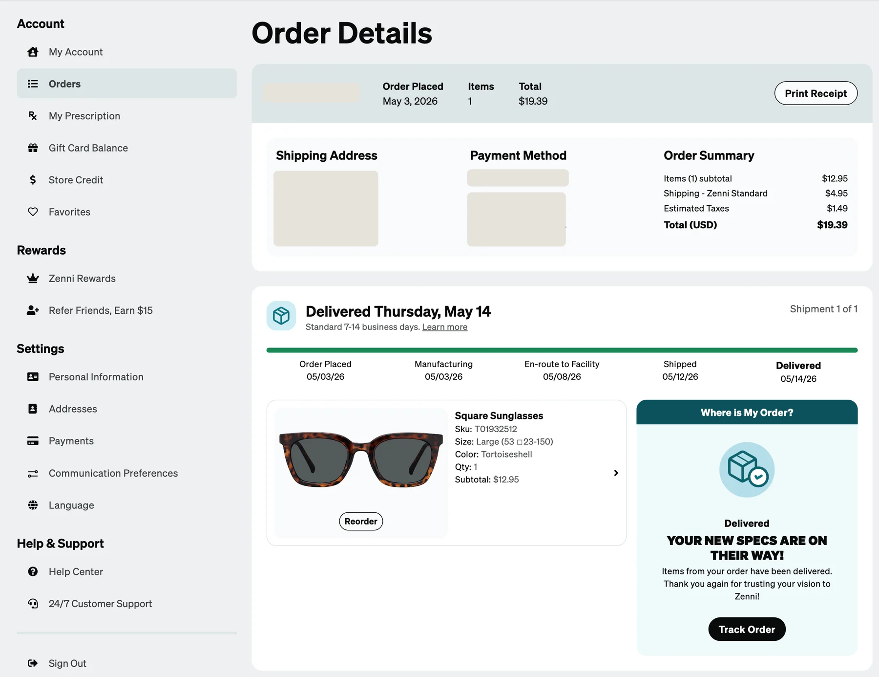
With the Account foundation in place, I led the next phase: reframing order tracking around customer confidence, and reducing the need for support without sacrificing core commerce performance. This was Phase 2, and it was possible because Phase 1, the Account foundation, had established the structures and design-system patterns it could build on.
00 / Context
The foundation was built. Now we could solve the harder problem.
The squad’s vision was “a frictionless customer experience where self-service is intuitive, support is effortless, and every interaction is a moment of delight.” Its north star was the rate of orders with zero customer support interaction. This initiative focused on one slice of that: reducing “Where is my order?” inquiries, known internally as WISMO.
Customer service had already made the case. In early 2025, order status and delivery questions were 12.3% of support contacts, about 17,000 a month, and 8 to 10% of all customer feedback was dissatisfaction about order status.
01 / People
Customers weren’t simply asking “Where is my order?”
They had just spent their money on a new pair, and they were excited but also anxious. Underneath the question, they were trying to understand whether what they were seeing was normal, what would happen next, and whether they needed to do something.
“WISMO??? My order has been sitting in this status for over 5 days!”
The data showed the same anxiety: customers checked their order status multiple times. What they wanted first was when they would get their glasses, in plain human language, with no math and no further investigation needed.
02 / System
Zenni had the data. The experience didn’t translate it.
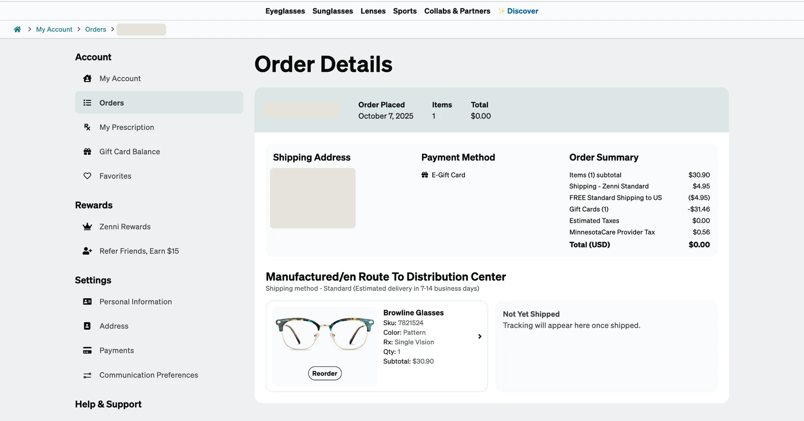
Behind every order was a detailed operational record: lens processing, frame assembly and final quality checks in the lab, a bulk shipment to a US facility, then a carrier’s own scan events. The customer saw almost none of it. Order Details showed a single line such as “Manufactured/en Route To Distribution Center”, with “Not Yet Shipped” beside the item and only a shipping speed, not a date.
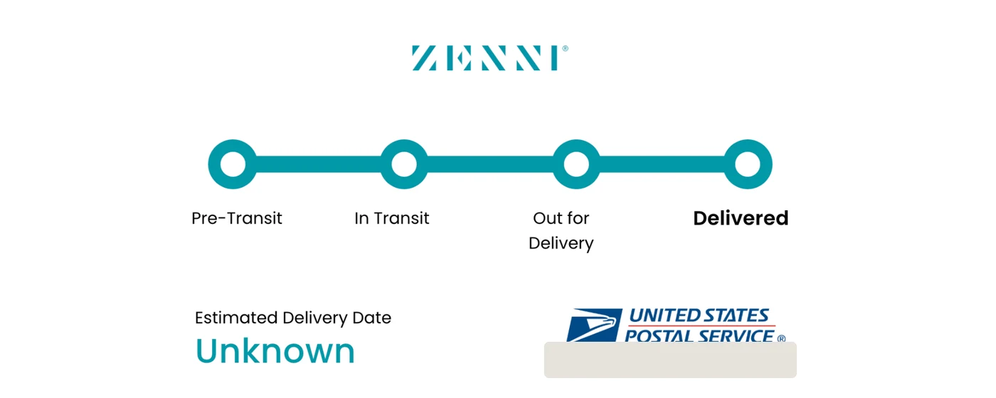
Once an order shipped, customers were sent away to a carrier tracking page. It could show “Estimated Delivery Date: Unknown”, even after the package was delivered.
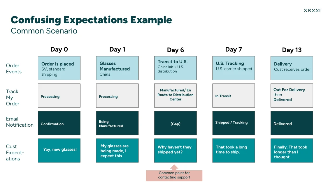
The emails, the account status and what was actually happening didn’t line up. Customer service mapped a common scenario: on day 6, the glasses are in a bulk shipment from the lab to the US, the account says “Manufactured/en Route to Distribution Center”, and no email goes out at all. The customer is thinking “Why haven’t they shipped yet?”, and that is the common point for contacting support.
03 / Gaps
A technically accurate status can still fail the customer.
When the product couldn’t provide enough confidence, customers had an obvious fallback: ask support. Modernizing Account in Phase 1 hadn’t solved that, because the problem wasn’t the interface. It was what the interface chose to say.
How might we give customers enough clarity and confidence to understand what is happening with their order, without requiring support to explain it?
Every status needed to answer four questions, in order: what is happening, what it means, what happens next, and what I should do. To decide between ideas, we agreed on three UX tenets:
- Deliver confidence instantly. Don’t make customers decode information and dig around to find out when they might receive their order.
- Protect the excitement, eliminate the anxiety. Be radically transparent about delays, and explain the customization process, because production times vary.
- No dead ends, always provide value. Every touchpoint anticipates what the customer needs next.
04 / Design
Make complexity useful, not visible.
The challenge wasn’t how much information we could expose. It was deciding which information changed what a customer understood or did next. The work happened in the open, in Slack canvases built from the templates I had made for the team after Account: a UX working doc with the tenets and an iteration tracker, the messaging framework, and a recorded prototype walkthrough, each open for anyone to comment on.
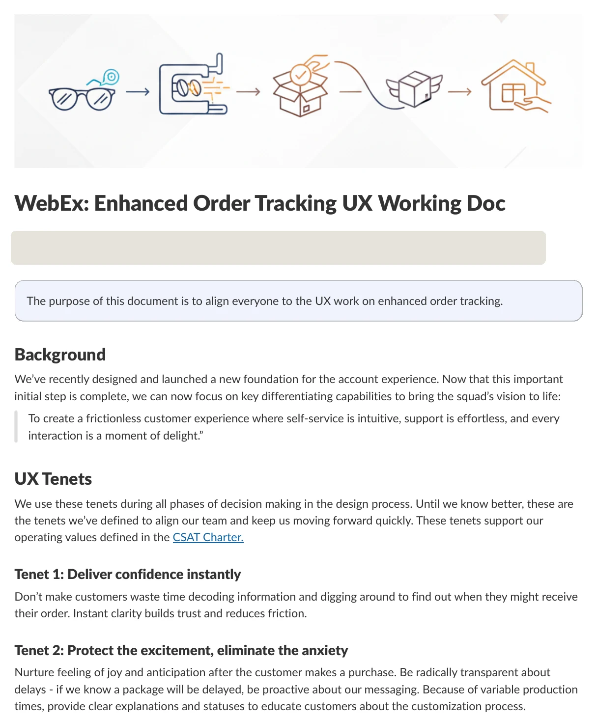
4.1 Start with everyone’s mental model
A 20-minute design jam with the whole team.
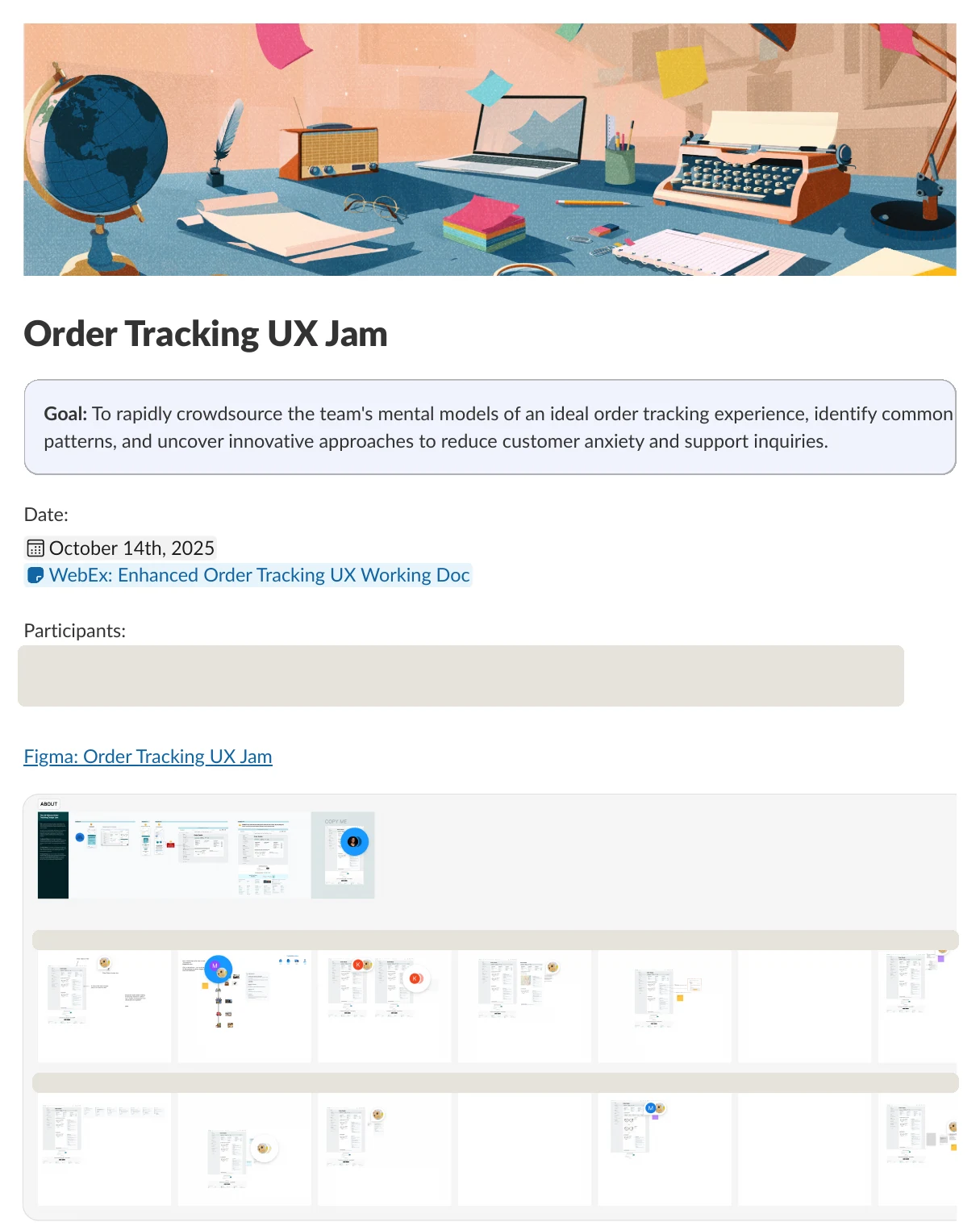
Before designing, I ran “The 20-Minute Order Tracking Design Jam”. The prompt: a week has gone by since you placed your order and it’s en route to the distribution center. Sketch a tracker. The goal was not a perfect design, but to explore as many ideas as possible and understand each other’s mental models, sketching as the customer.
Ten teammates took part. The follow-up lived in a Slack canvas too: the goal, everyone’s sketches side by side, and an affinity map that grouped the ideas into four themes: information hierarchy and clarity, brand voice and delight, transparency and proactive communication, and friction in the interface. It also kept the open questions in view, like whether people care that something is en route to a distribution center, and how we talk about China.
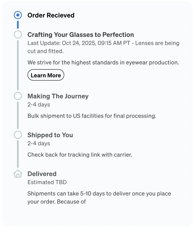
One insight shaped what came next: customers care most about the current status and a few key milestones, so the active step should be the focal point and the timeline should be four or five clear steps. I carried three directions forward: lead with the most important information and keep details a tap away, bring in the brand’s personality, and build trust during delays.
4.2 What is happening: a tracker for every shipment
Five milestones, at a glance, at the top of the order.
Shipped
Every shipment in an order gets its own tracker, similar to the one customer service already used in their workstation. It shows five milestones, so customers can see at a glance where their order is. Each step has three states: not yet started is grey with no date, in progress is half filled with the date it started and a bold label, and complete is a solid bar with the date it finished.

Each shipment leads with its estimated delivery dates. Before, Order Details showed only a shipping speed, so customers jumped between pages and did the math themselves. Orders with more than one shipment now say so plainly, “Shipment 1 of 2”, with a box icon for each.

4.3 What it means, and what happens next
The step customers call about, explained in context.
Shipped
A “Where is my Order?” card sits beside the items and changes with the current milestone. En route to the US facility receives the most customer service calls, so that step says it outright: “Your glasses are in a bulk shipment from our lab to our US facility. We’ll post an update the moment it arrives stateside!” The aim was to make the tracking gap feel expected, not alarming, while keeping the excitement of a new pair.
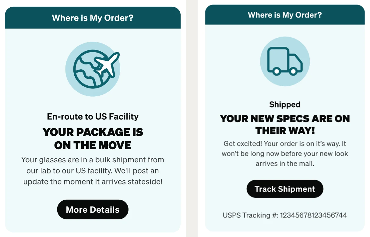
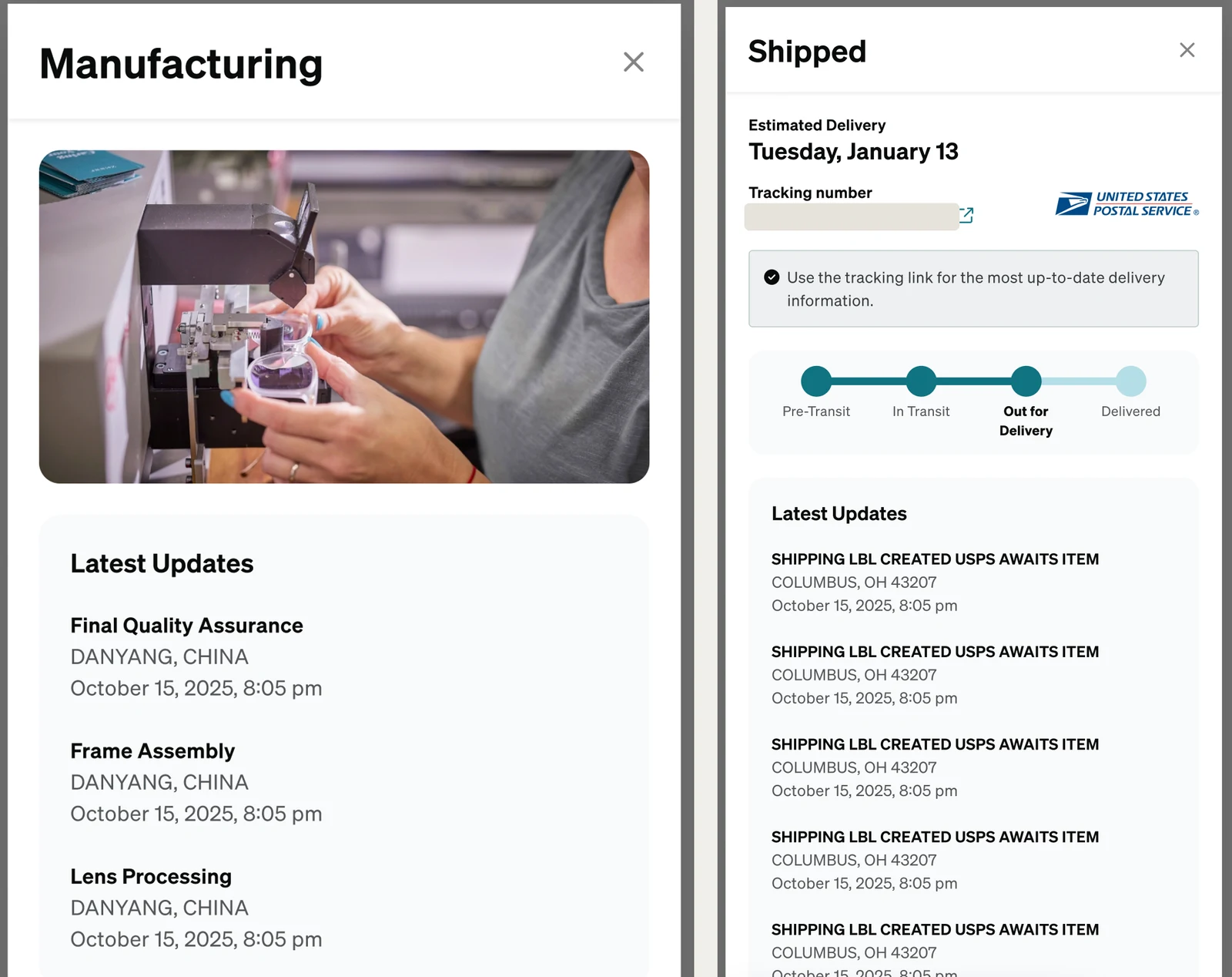
The card opens a details drawer for the current step. During manufacturing, it shows production events such as lens processing, frame assembly and final quality assurance, with where and when they happened. Once shipped, every carrier event appears inside the account page instead of on another site, and the estimated delivery becomes a specific day. The tracking number still links to the carrier for anyone who wants more.
4.4 One framework for every route
The copy had to scale with the supply chain.
In the developer handoff
I recorded a walkthrough of the prototype and shared it with the squad on October 31, 2025. Ecommerce leadership pushed on scale: some products ship from China to the US, some from China to Canada, next year some would come from Thailand, and others ship from the US to Europe. The copy had to account for every combination.
How might we design a scalable messaging framework that adapts to complex, multi-origin logistics, so every customer feels confident and informed even when their items follow complex global routes?
I answered with a messaging framework I owned, built on three principles: new origins and destinations shouldn’t need a redesign, terminology must match the item’s actual status, and the long gap between manufacturing and last-mile shipping should stop being a black box. The tracker always has the same five slots. Two of them change with the order:
- Step 2, fulfillment. “Manufacturing” for custom and prescription items being made in the lab, and “Order Processing” for stock items picked from inventory. A mixed shipment shows as custom.
- Step 3, the middle mile. “En-route to US Facility” for imports to the US, “En-route to Regional Facility” for every other route, and hidden when the order ships directly within the US.
| Route | Item | Step 2 | Step 3 |
|---|---|---|---|
| China or Thailand to USA | Custom / Rx | Manufacturing | En-route to US Facility |
| USA to USA | Custom / Rx | Manufacturing | Hidden (direct ship) |
| China or Thailand to Canada | Custom / Rx | Manufacturing | En-route to Regional Facility |
| USA to global | Custom / Rx | Manufacturing | En-route to Regional Facility |
| USA to USA | Stock / Plano | Order Processing | Hidden (direct ship) |
| China or Thailand to USA | Stock / Plano | Order Processing | En-route to US Facility |
| E-gift card | n/a | Hidden | Hidden |
Thailand didn’t need new design. Its logic mirrors China’s, which was the point.
4.5 What I should do: the hard paths
The tracker had to work beyond the happy path.
In the developer handoff
The same review asked how the design handled issues and delays. The handoff on November 13, 2025 included templates for prescription and non-prescription items, e-gift cards, older orders, orders on hold, data errors and routes with no delivered step, across desktop, tablet and mobile, where the tracker turns vertical. On hold was the most consequential. California law requires a photo of the prescription, so an order on hold says exactly what is needed and by when: “Please upload Rx by April 5th.”
4.6 What we left for later
Some ideas were right, but not yet.
Direction for later phases
We discussed showing the China locations during manufacturing to ease anxiety, which raised its own questions about brand perception. Proactive delay messaging, a predictive delivery date once last-mile data could support it, and a state for orders with no estimated date were carried forward as later work.
05 / Impact
Customers needed us less. The business held steady.
The new experience launched across the US and Canada, and was evaluated in a 50/50 A/B test against the legacy experience.
- Chat initiation from Order Details fell by 0.25 percentage points.
- Chat initiation from the Order List fell by 0.10 percentage points.
- Conversion, average order value and add-to-cart held stable, and exits to help pages decreased modestly.
When customers could understand what was happening with their order, they were less likely to need someone at Zenni to explain it.
The work also changed how the UX team worked. The working doc, the design jam and its follow-up, the messaging framework and the recorded walkthrough reinforced the canvas practice I started on Account, and became templated ways of working the UX team could reuse on its own projects.
The interface was Phase 2. The architecture started earlier, in the Account foundation that made it possible.