Zenni Account: Build the foundation before the feature.
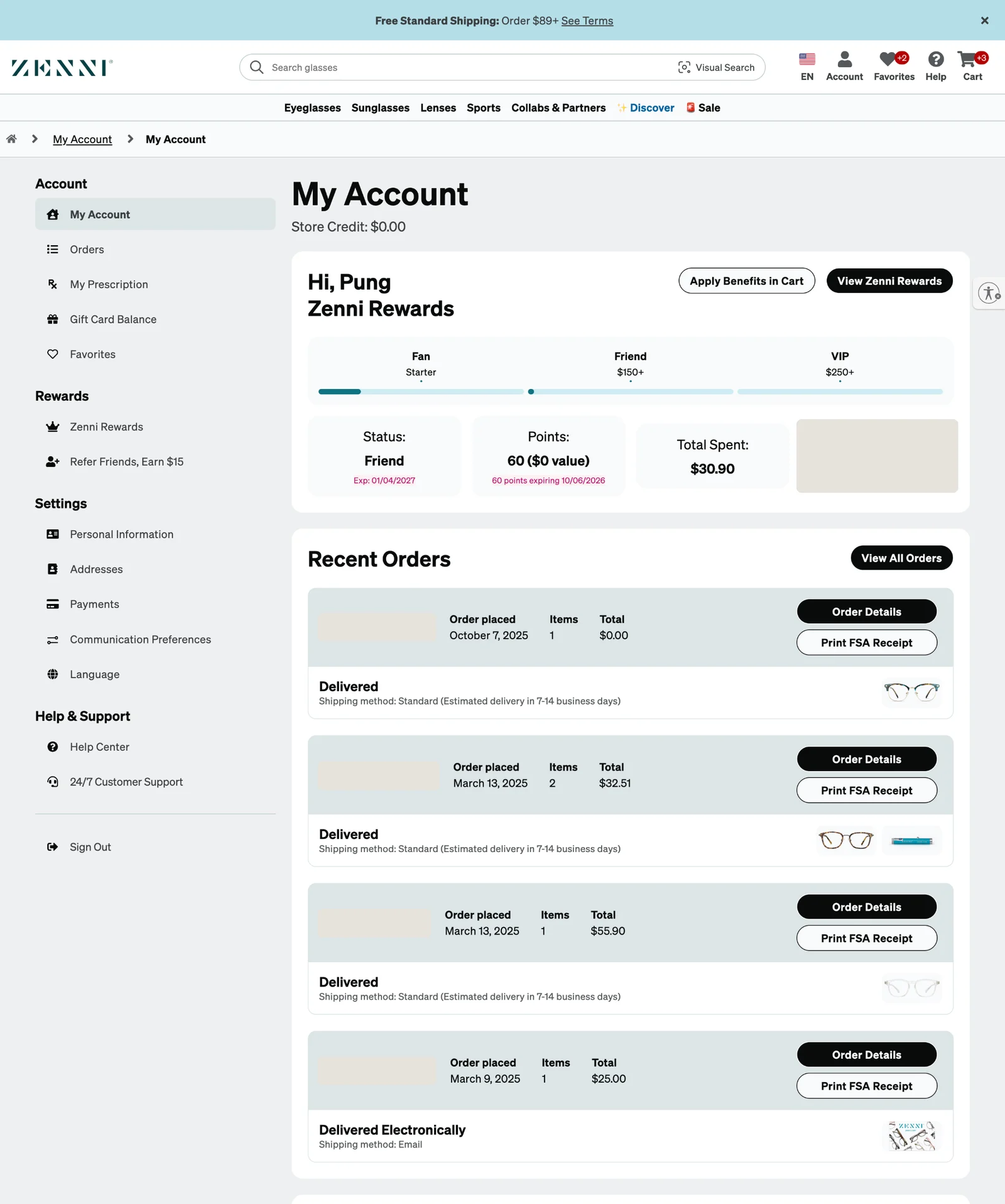
I modernized a fragmented account experience while establishing reusable product patterns and a healthier working relationship between product design and the design system. This was Phase 1. Phase 2, Enhanced Order Tracking, was built on it.
00 / Context
Barebones account pages, a new brand, and a new priority.
Zenni’s Account management pages were barebones. The organization had historically prioritized metrics like average order value, and Account didn’t move them directly, so it had never been a priority.
Two things changed that. First, branding unveiled new guidelines: a major visual overhaul, and a single voice, tone and vibe for how Zenni wanted to be perceived. The website wasn’t up to that standard, so a new design system was created while major sections of the site were redesigned at the same time.
Second, Zenni’s leadership changed. A new leader made a “best-in-class foundation” a major organizational goal for 2025. My UX manager saw the opportunity and assigned me to Account before it was on the roadmap. I started in November 2024.
01 / People
Customers thought of Account as one place. The product did not.
Customers didn’t care that orders, prescriptions, payment methods and profile information came from different parts of the business. To them, Account was one thing.
My account is where I manage my relationship with Zenni.
What they came to do was concrete:
- An order placed a week ago is in transit, and the customer needs an estimate of when it will arrive.
- One pair in an order is on Rush service and the others are on Standard, and the customer needs to confirm the arrival date for each.
- The customer needs to know when their prescription was last updated, to decide whether to see an eye care provider before their next order.
- The customer needs to know what Rewards credit they have for their next purchase, and how long they have to use it.
- The customer lost their return label and needs to print it again.
Customer service added one more. A top customer request was to show frame size prominently in order history, so customers could use it as a reference when buying their next pair.
02 / System
Account was a collection of pages, and the design system barely existed.
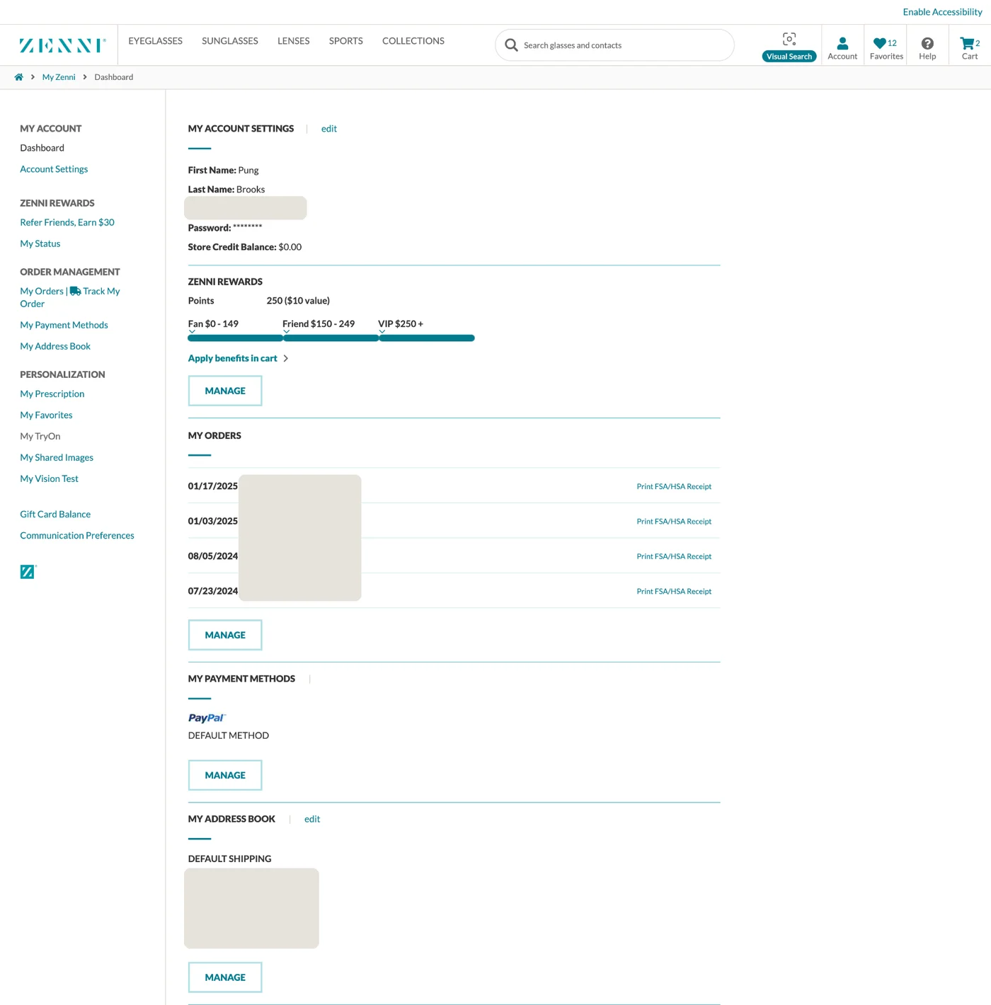
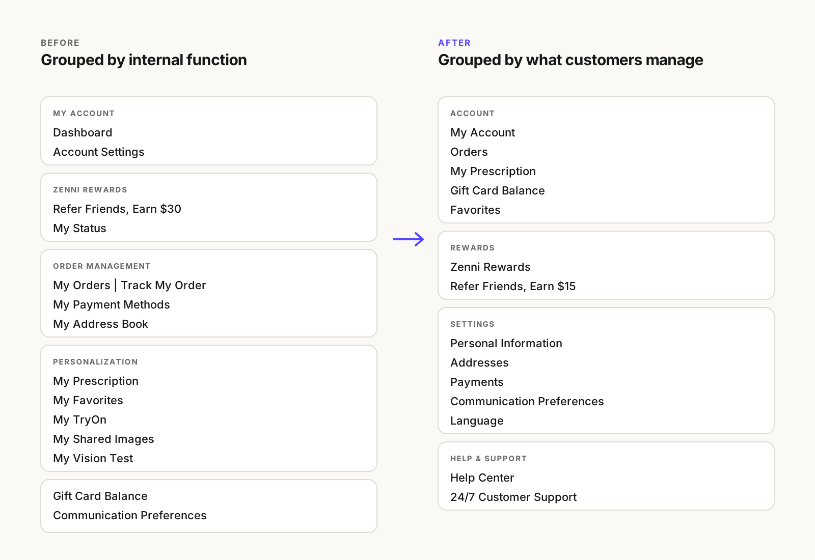
Account had evolved one page at a time, built at different times for different needs. Each page had its own structure, data, states, actions and technical history. The navigation showed it: pages were grouped under labels like Order Management and Personalization, alongside features such as TryOn, Shared Images and Vision Test. It described how the business had built Account, not what customers came to do.
At the same time, the new design system was barebones. I was designing a system at the same time as the design system. Whatever patterns Account needed, such as navigation, hierarchy, cards, responsive layouts, status and actions, either didn’t exist yet or hadn’t been tested on a real product.
03 / Gaps
Modernizing the UI wasn’t enough.
Individual pages worked, but the experience wasn’t operating as a coherent system. Simply reskinning the existing pages would have reproduced today’s constraints in tomorrow’s interface, on top of a design system that was still changing underneath them.
How do we modernize today’s experience without designing ourselves into another corner tomorrow?
Not every gap belonged in the first release. The MVP focused on the structure and the patterns every Account page shared. Store credit, international support, enhanced order tracking and favorites were set aside as later work that the foundation needed to make room for.
04 / Design
Consistency was not the same thing as sameness.
The organization needed reusable foundations without forcing every product problem into the same template. I established common structure and reusable interaction patterns while preserving room for domain-specific needs. The consequential decisions were not always visually dramatic: what became reusable, what stayed specific, and how the system could support capabilities we had not designed yet.
4.1 Organize Account around what customers manage
One navigation, grouped the way customers think.
Shipped in the first release
The new navigation panel groups Account into Account, Rewards, Settings, and Help and Support. On desktop it is visible on every Account page, so customers always know where they are and can move between orders, prescriptions and settings without starting over. Shared Images was hidden from the interface.
4.2 Turn order history into a list and a detail
Orders answer the most questions, so they got the most structure.
Shipped in the first release
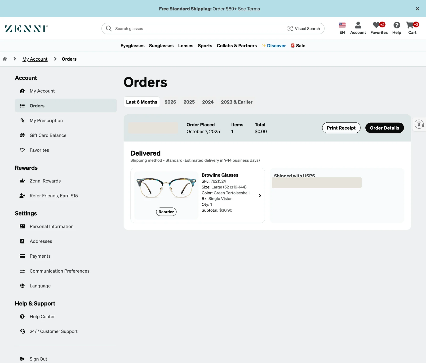
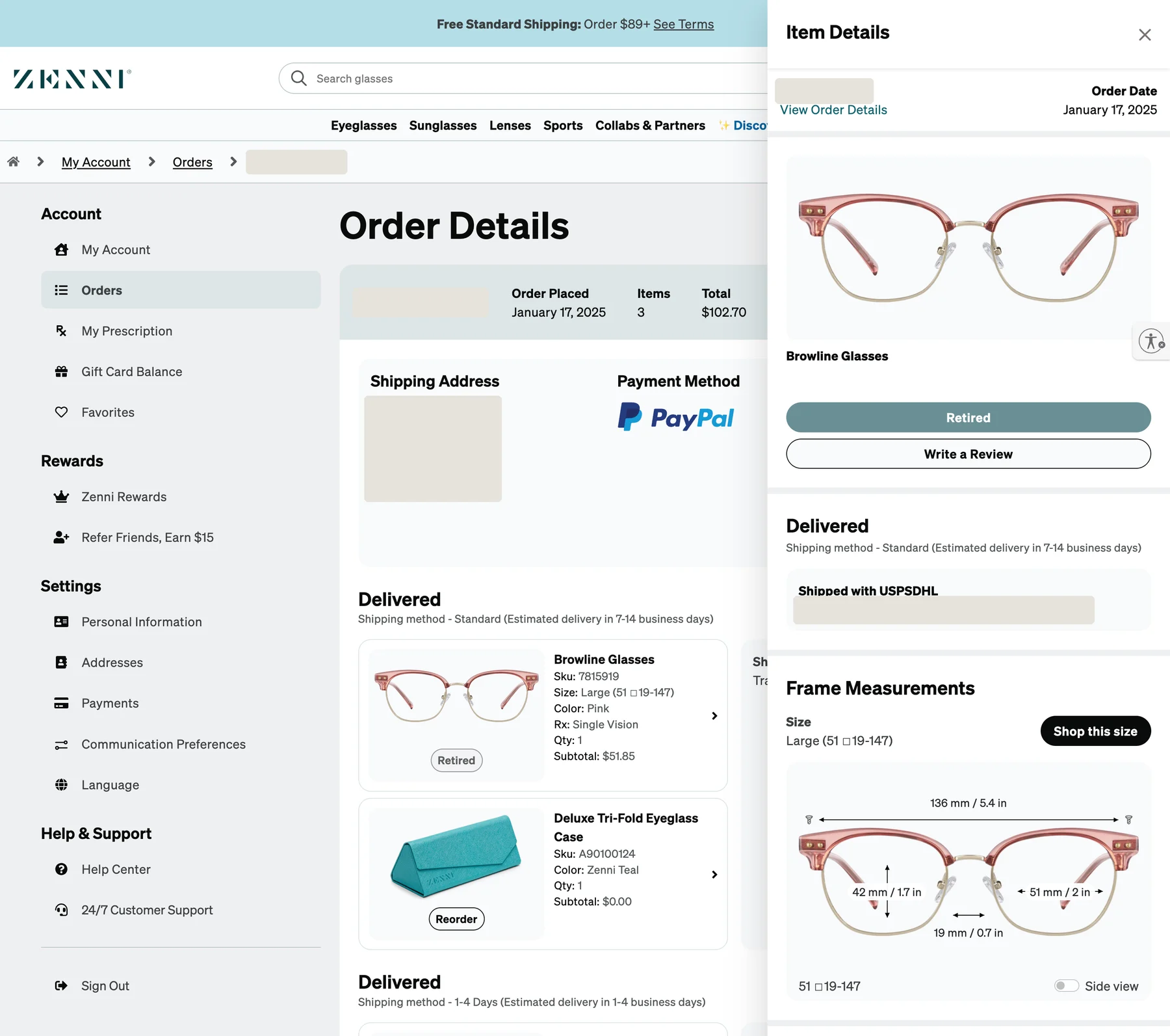
I started with a low-fidelity order history in which each order is a card and each item opens an item details panel, so customers can check status, track a shipment, buy again or start a return without losing their place.
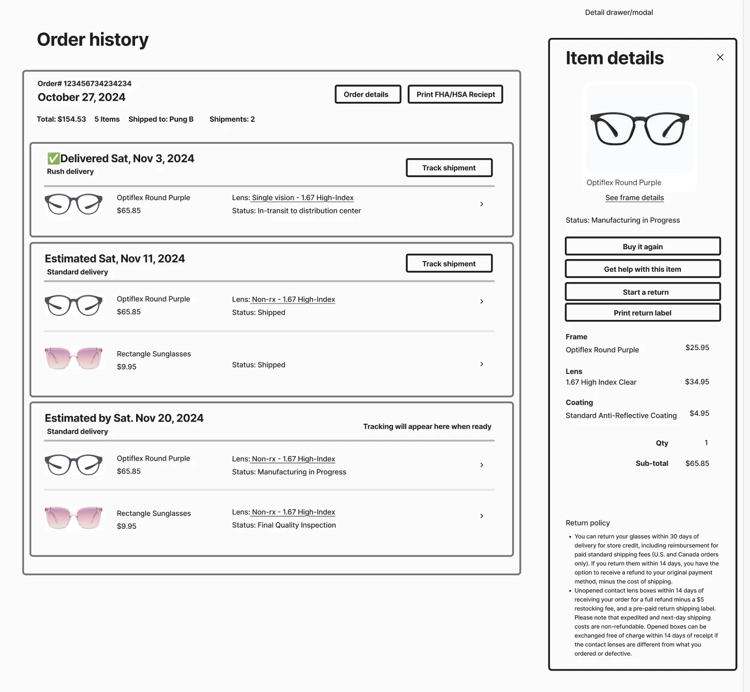
The shipped Orders page and Order Details follow the same structure. The item details panel later made room for the customer service request: frame measurements, with a “Shop this size” action.
4.3 Build a pattern once, then use it everywhere
The address form was the clearest case.
Shipped in the first release
The Add and Edit Address modal was designed to be used throughout the entire site, not only in Account. I grounded it in Baymard’s checkout research: an address validator that customers can override and that highlights its suggested changes, a single full-name field, Address Line 2 behind a link, and city and state detected from the ZIP code.
The same thinking produced shared patterns for empty states, such as no orders yet or a brand new account, and for error and success feedback, so each Account page didn’t invent its own.
4.4 Remove what doesn’t save customers time
Fewer options, when the options didn’t help.
Shipped in the first release
Some decisions were removals. Customers can’t set PayPal, Google Pay or Apple Pay as a default payment method, because that doesn’t actually save them time at checkout. A “claim 50 points” button that wasn’t compliant came out of communication preferences. Confusing referral copy was rewritten, and when a customer deletes their default address, they are asked to choose a new one.
4.5 Leave room for capabilities we hadn’t designed yet
A useful foundation does not predict every future feature. It gives future teams better choices.
Direction for later phases
We knew Orders had room to become much more useful. I structured the foundation so later iterations could support richer status, progressive information, contextual actions and more sophisticated post-purchase communication. Work after the MVP included store credit, frame measurements, international support and enhanced order tracking.
Building with the design system
Account was the design system’s pressure test.
We built Account and the design system together. Real pages, real data and real edge cases showed where the system’s early decisions held and where they didn’t. We worked through those kinks on my project, developed patterns together, and I contributed major components and patterns back to the system along the way.
I also advocated for the product designer inside the design system. Where did the system speed up product work, and where did it create friction? When should a product team extend a pattern, and how should that learning return to the system? Where the system helped, I leaned on it. Where it got in the way, I raised it, and when Account needed to extend a pattern, the change went back to the system instead of staying a one-off.
Making decisions in the open
There was no shared place to make and track decisions, so I made one.
I led the project through collaborative documentation in Slack canvases. That is where the decisions happened. Partners, and really anyone, could see what was decided and why, and offer feedback before it was final. There was no existing mechanism to track decisions or collaborate this way, and it became how my team saw me lead my projects.
The practice outlasted the project. I turned the canvases into templates the team could adopt and structure however they needed. The working doc, the messaging framework and the prototype walkthrough on Order Tracking all started from them.
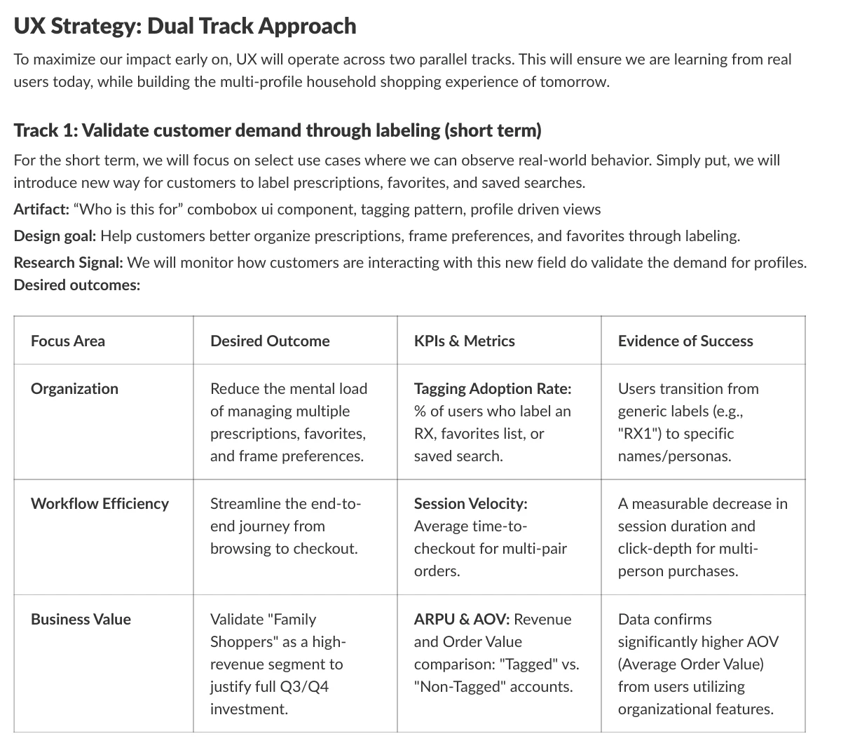
The template was most useful when an idea was still ambiguous. Multi-Profile Shopping, a later initiative to support households buying glasses for the whole family, started as little more than a goal. Its working doc turned that into things the team could start to understand together: a north star, working tenets, and two tracks of UX work. One validated demand quickly by letting customers label prescriptions, favorites and saved searches. The other designed the long-term household experience. Each track named its desired outcomes, its metrics and the evidence of success we’d look for.
Validation and launch
Tested with customers, reviewed across the business.
In January 2025 I ran a usability test built on the customer scenarios above, then iterated through team reviews, a mobile team review and a customer service review before detail design. Developer handoff was organized by ticket, with one design page for each piece of work, and visual QA followed the build. The UX runway was three months, and implementation took four.
05 / Impact
The outcome was optionality.
The redesign gave the team a foundation to build on rather than another one-off redesign.
- Account’s pages now share one navigation, one structure and one set of patterns.
- The design system was pressure tested on a real product, and gained major components and patterns from it.
- The decision-making canvases became templates the team adopted.
Foundational work is often best measured by what becomes easier to build afterward. This foundation didn’t remain theoretical: the next phase used it to tackle a deeper post-purchase problem. See Phase 2, Enhanced Order Tracking.