Amazon Relay Mobile: Helping truck drivers execute loads more efficiently and confidently
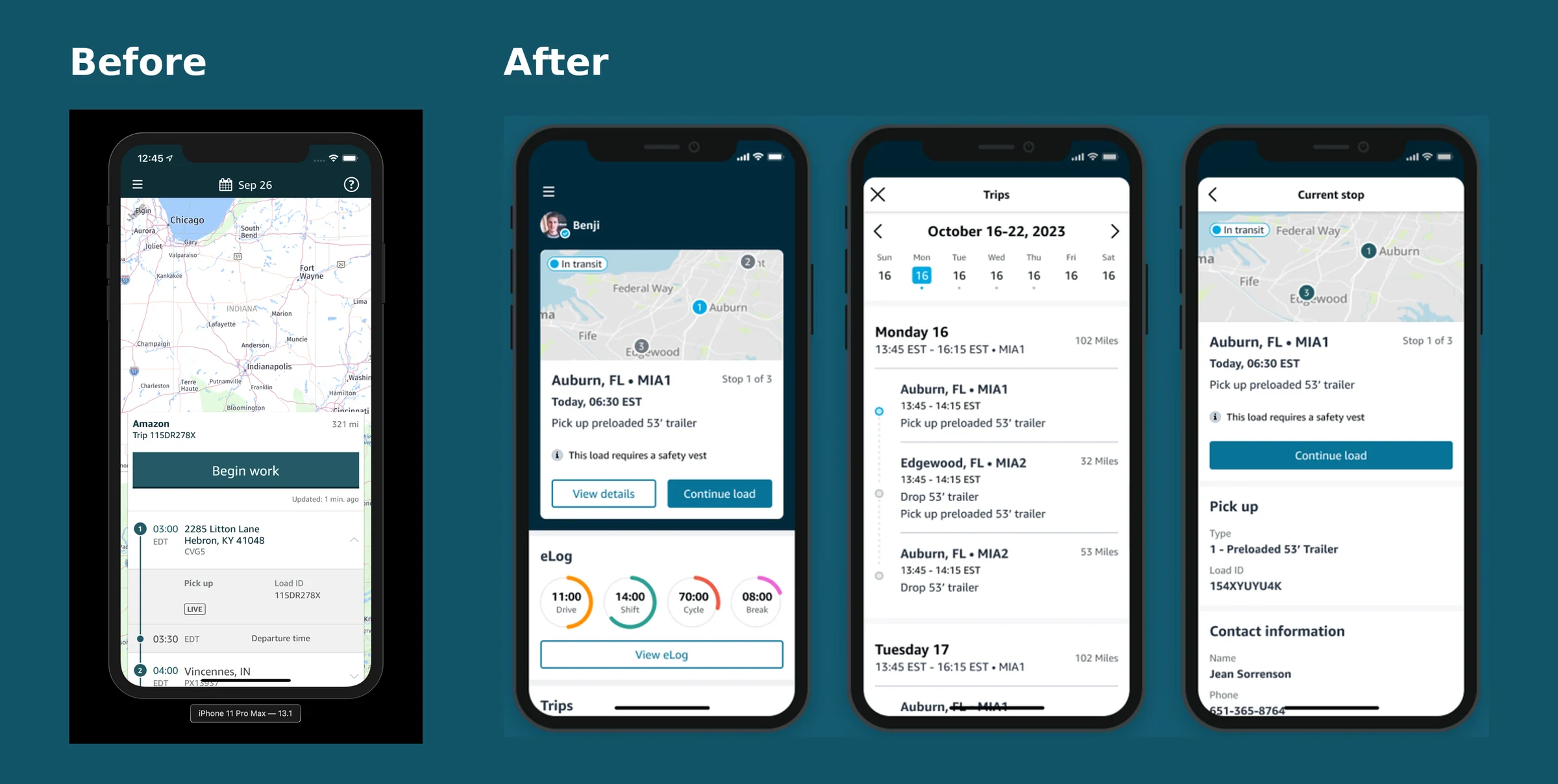
I inherited a stalled, in-flight request for a “dynamic home screen” and turned it into a new information architecture for the Relay mobile app. Within a month of release, individual product teams were shipping new features without coordinating app releases, and the framework enabled four major new capabilities in 2022, while drivers kept executing loads at the same rate.
Leadership’s ask sounded like a home-screen project: extend an app built for truck drivers to carriers and others. The real work was architectural. I had to help turn that ask into a structure the team could align on, test, ship incrementally and keep building on.
00 / Context
The app had outgrown the workflow it was built around.
Amazon Relay connects transportation carriers to the Amazon freight network and provides them with all the tools needed to book a variety of work to keep their trucks moving, manage and execute work, manage performance and more. The Relay app launched in 2017 to make it easier for truck drivers to pick up and drop off loads at Amazon warehouses, with about 10,000 active drivers. By 2022 it had more than a million, and the app had grown to support multiple aspects of a driver’s daily workflow such as trip planning, navigation, inspections, electronic logging and more.
The work had grown more complicated too. New programs added new facilities like third-party shipper warehouses, post offices, rail yards, ship yards and airports, and new types of drivers operating different equipment such as box trucks and containers. Five separate dev teams were now contributing to the driver experience. The app, originally designed for a narrow set of use cases and maintained by one product team, had outgrown itself. It needed a system that would let separate product teams contribute to the experience while maintaining consistency and standards.
Leadership wanted Relay Mobile to serve carriers, dispatchers and other users, not only drivers. But the existing app was organized around one rigid sequence for executing a trip, and every new capability had to squeeze into it.
The effort started with the dev team, who wanted to move the tech stack to a plugin federated model so multiple teams could own their own content on the home screen and develop those widgets independently. The ask was to design a dynamic home screen that could support any number of user types and use cases. I worked closely with my dev counterpart, driving each phase of the project from discovery to design, and brought my PM partners and stakeholders along the way through collaborative workshops and reviews.
The constraints were real. The initiative was seen as a technical improvement, so PM and dev resources were limited, and the MVP needed to launch ahead of new features on the year’s product roadmap. Yard procedures were unpredictable, and there was resistance to change.
“Dynamic” didn’t describe anything yet.
The work was already in flight when I joined, and it had been framed as a “dynamic home screen” before I started. Beyond extending the app to carriers, it wasn’t clear what that meant, so I tried hard to understand what exactly would make the home screen better for drivers.
Every modern app should be dynamic, so the word alone didn’t describe a solution. And if it meant the contents would shuffle and change each time a driver opened the app, based on what we thought was going on with them, I was adamant that it was the wrong approach. Drivers want to get in and out. A new experience every time they execute work would put extra onus on them to figure it out. Seeing them work first hand, I knew they weren’t hanging out on the home screen; they were getting the information they needed before and during their work. Most owner-operators also work with other companies, so Amazon Relay is not the center of their world.
To move the conversation forward, I started a weekly show and tell. Even when ideas weren’t fully fleshed out, managers needed to see that we were making progress, and it established trust quickly. I modeled ideas side by side: the existing design against a more standard home screen layout that gives drivers access to information no matter their context. That bought time to explore further, and the same approach eventually earned buy-in for the new structure.
Tenets
- Driver safety first. Low-touch execution, assuming hands-free operation in normal scenarios.
- Generic but flexible. Relay can scale without additional development effort or compromising the experience.
- Incremental improvements. Deliver smaller improvements more often rather than big steps at a time.
Project goals
- Usability. Empower drivers to access the information they need when they need it, reducing the need to call support.
- Consistency. Migrate to the Meridian design system.
- Scalability. Lay a foundation that can easily onboard new programs and use cases.
- Parity. Ensure drivers are able to execute loads at the same rate.
01 / People
Drivers did not need step-by-step instructions. They needed information.
Discovery came in two parts. First I audited the existing app, interviewed key stakeholders, and dug into existing feedback and data. Then I conducted field research and user interviews, including a ride-along with a truck driver picking up and dropping off loads at Amazon and shipper warehouses. In the field, drivers checked in at shipping windows with paperwork in one hand and a phone in the other, and photographed bills of lading from the cab between stops.
Several findings changed how I thought about the app:
- The app’s execution workflows did not always match the real workflow at a site.
- Drivers did not need step-by-step instructions to do their jobs. Each step they had to complete in the app was more work for them.
- Information in the workflows was not always accurate, so drivers had found workarounds to get to what they needed, and relied heavily on tribal knowledge and a strong Relay driver community.
- Being on time is crucial for their performance, so drivers often arrive hours early. The day feels like hurry up and wait.
- Drivers did not want to be bothered by messages unrelated to the work in front of them, but did want quick access to training material and other ways to improve.
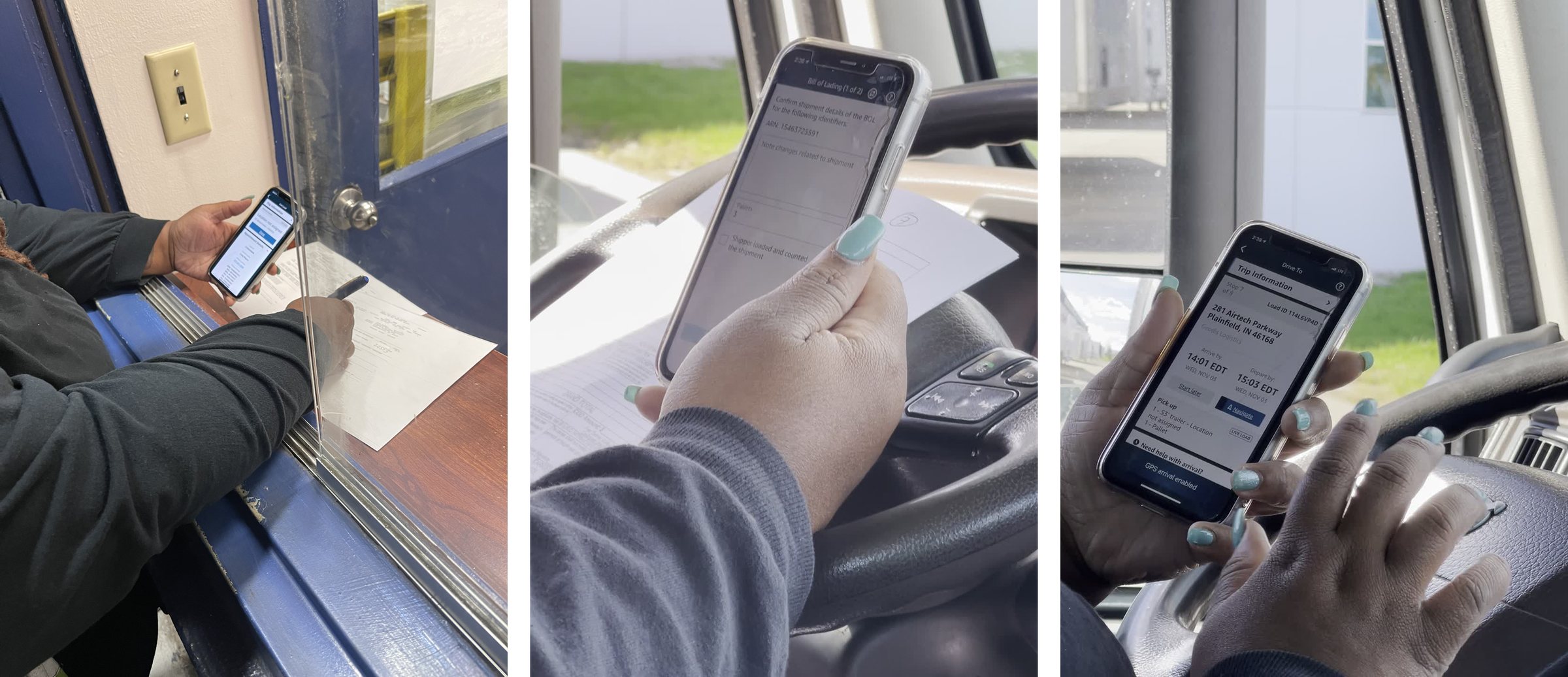
Discovery research also showed that drivers think about information in three dimensions: what they need before work, during work, and all the time. The old app handled the first two reasonably well. It struggled with the third, which is exactly the information drivers need most when things don’t go as planned, like a reference number for a shipper or a document from an earlier stop.
Give drivers the information about their work whenever they need it, instead of walking them through steps they already know.
Methods app audit · stakeholder interviews · ride-along · field study · driver interviews · journey mapping
02 / System
One linear workflow could not absorb new users and use cases.
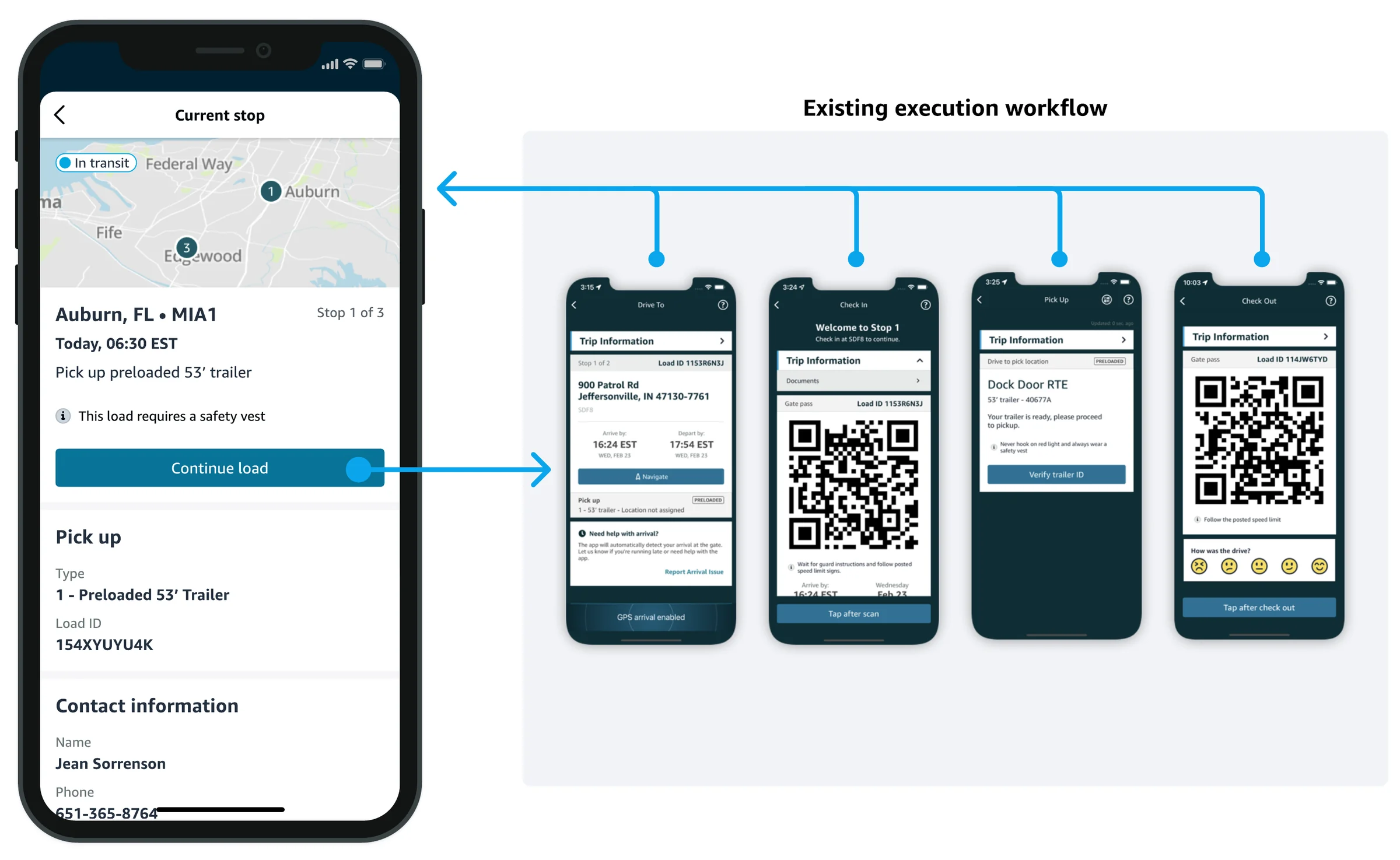
I worked with the senior software engineer to map the existing experience end to end. From the trips card, drivers were launched into a linear workflow. Each step was its own uniquely named screen, with unique but sometimes overlapping content. Every step had one primary action to move forward, or a back button that exited to the trips card, where drivers had to select “Resume work” to get back to where they were.
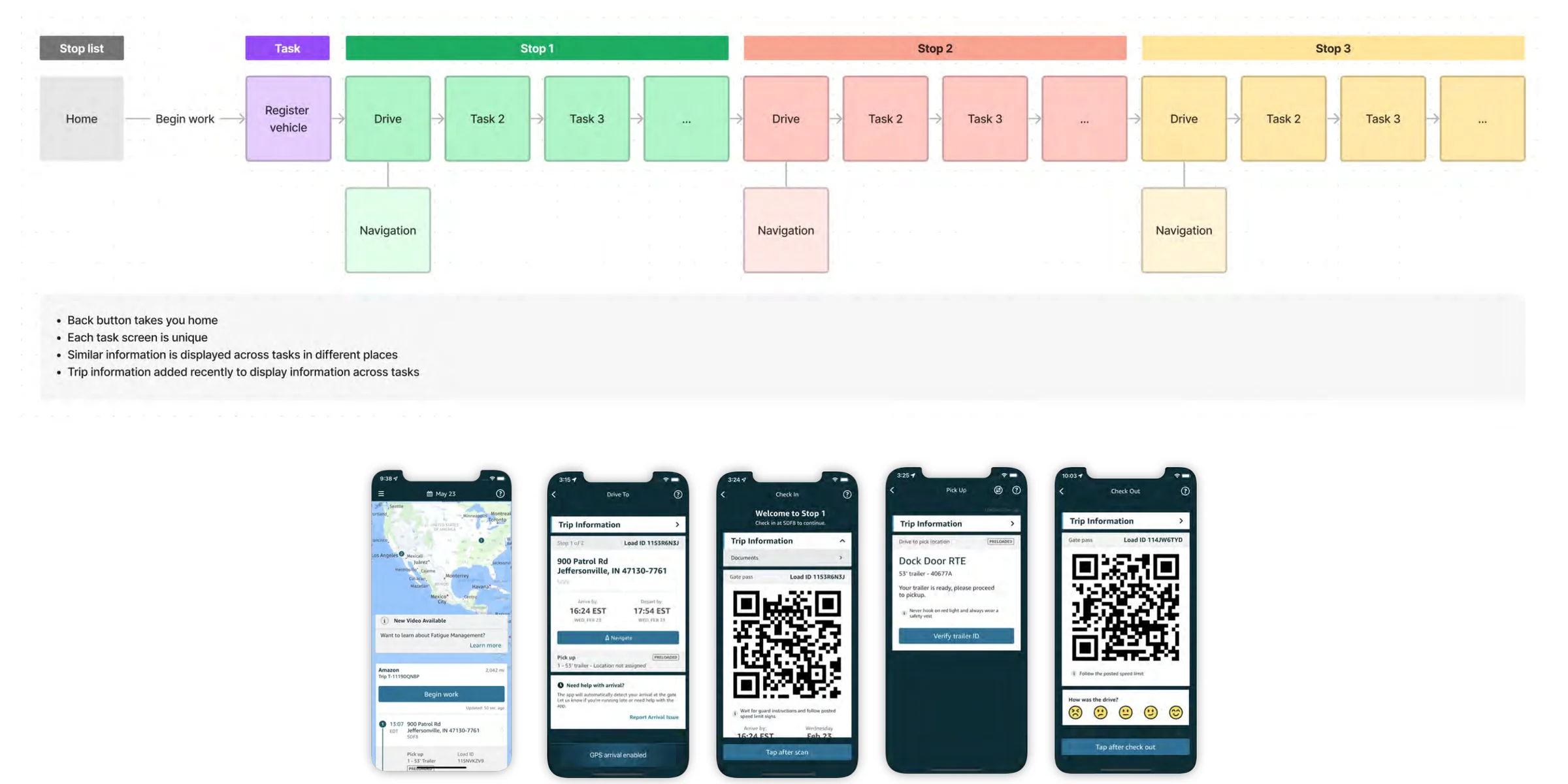
The structure caused the problems we saw in the field. Information was split across task screens, similar information appeared in different places, and anything outside the current step was hard to reach. A late fix had added a trip information card to hold documents, reference numbers and special instructions, but it was a patch on the same structure. The information architecture also had no place for content drivers care about, such as driver training, or future capabilities like drive score.
The technology had the same shape. Tightly coupled code made every new capability expensive to design, build and test, and one team was a bottleneck for custom workflows. In parallel with the redesign, engineering began building a federated foundation so several teams could contribute to the app independently. The UX needed a matching structure: one where each team’s experience had a natural place to go.
I also had to define what we were not changing.
The redesign could not stop drivers from working. Drivers needed to execute loads at the same rate as before, app feedback was generally good, and there was one other engineer beyond the senior engineer I worked with. Those facts set a firm boundary: the new structure had to wrap the existing execution workflow rather than replace it in the first release.
03 / Gaps
The app was organized around steps. Drivers think about stops.
I facilitated a journey mapping session to align the team on the customer problem. Two themes came out of it:
- Drivers need more information about their stops.
- Drivers need to be able to access that information whenever they need it.
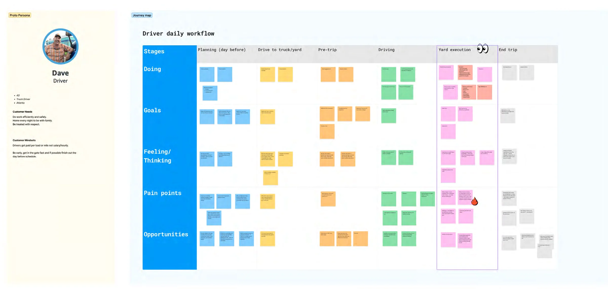
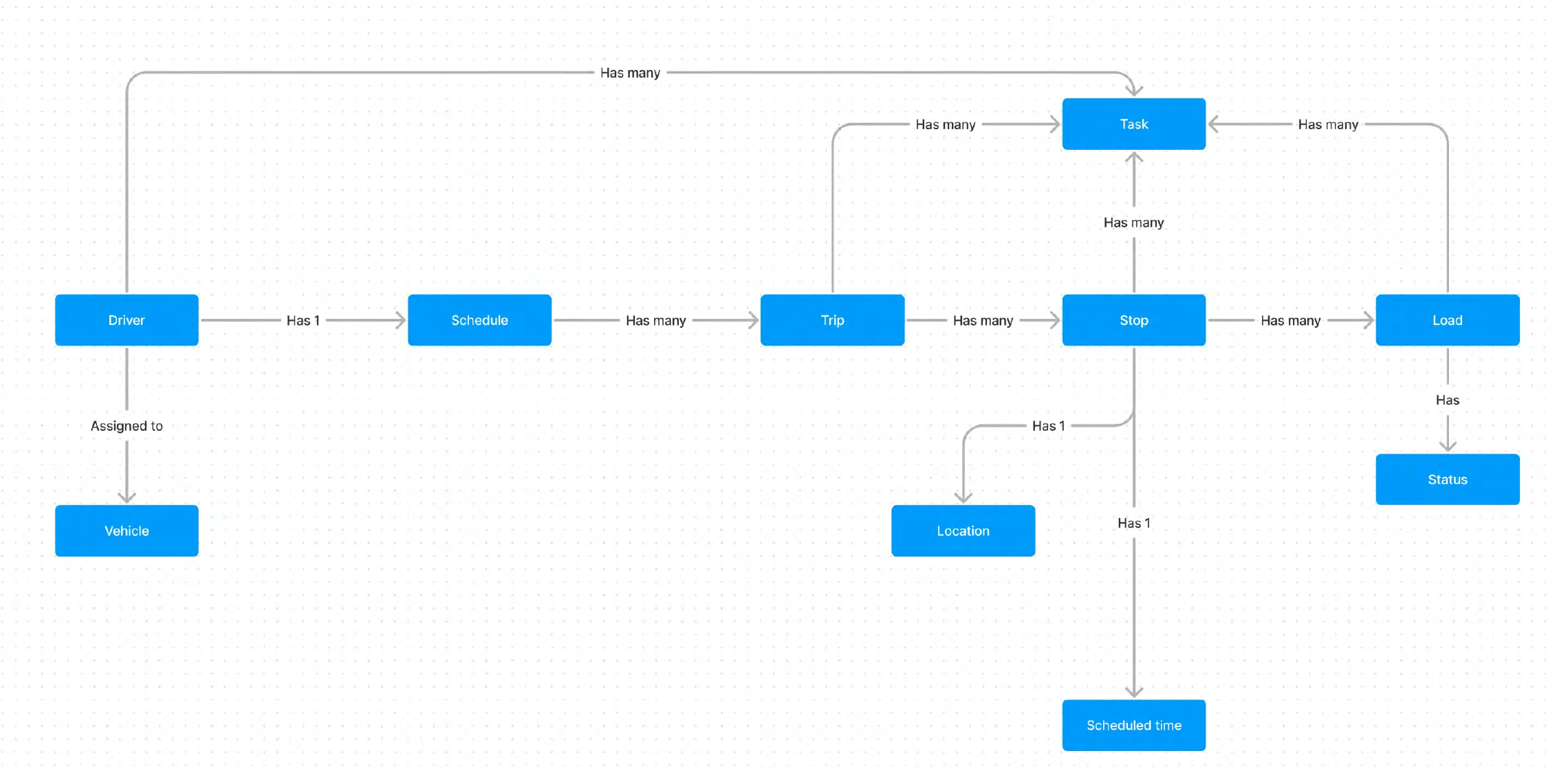
Those themes let us reframe the original ask, design a dynamic home screen, into a problem statement. Before diving into designs, I facilitated a lightweight object mapping session to align on the nouns drivers use to describe their work and identify how Amazon schedules that work: a driver has a schedule, a schedule has many trips, a trip has many stops, and each stop has a location, a scheduled time and its loads. That model gave us a structure built from drivers’ own language instead of from screens.
How might we help drivers execute all loads more efficiently and with more confidence?
Not every gap was worth solving in the first release. Drivers could already execute loads, and app feedback was generally good, so rebuilding the execution workflow would have added risk without closing the gap that mattered most: access to information. The first release focused on that access, through the home screen, schedule and stop details. Sticky tasks were set as direction for later phases.
04 / Design
The final screens look simple. Getting there required a few structural decisions.
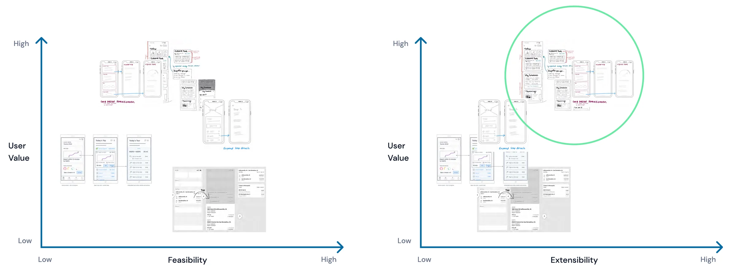
I ran a brainstorming session with the team and we placed the ideas on two charts: user value against feasibility, and user value against extensibility. Extensibility mattered as much as feasibility, because the goal was a structure that could keep growing. We selected one approach together to explore further.
4.1 Make the home screen a curated summary, not a workflow
The home screen should orient drivers, not do the heavy lifting.
Shipped in the first release
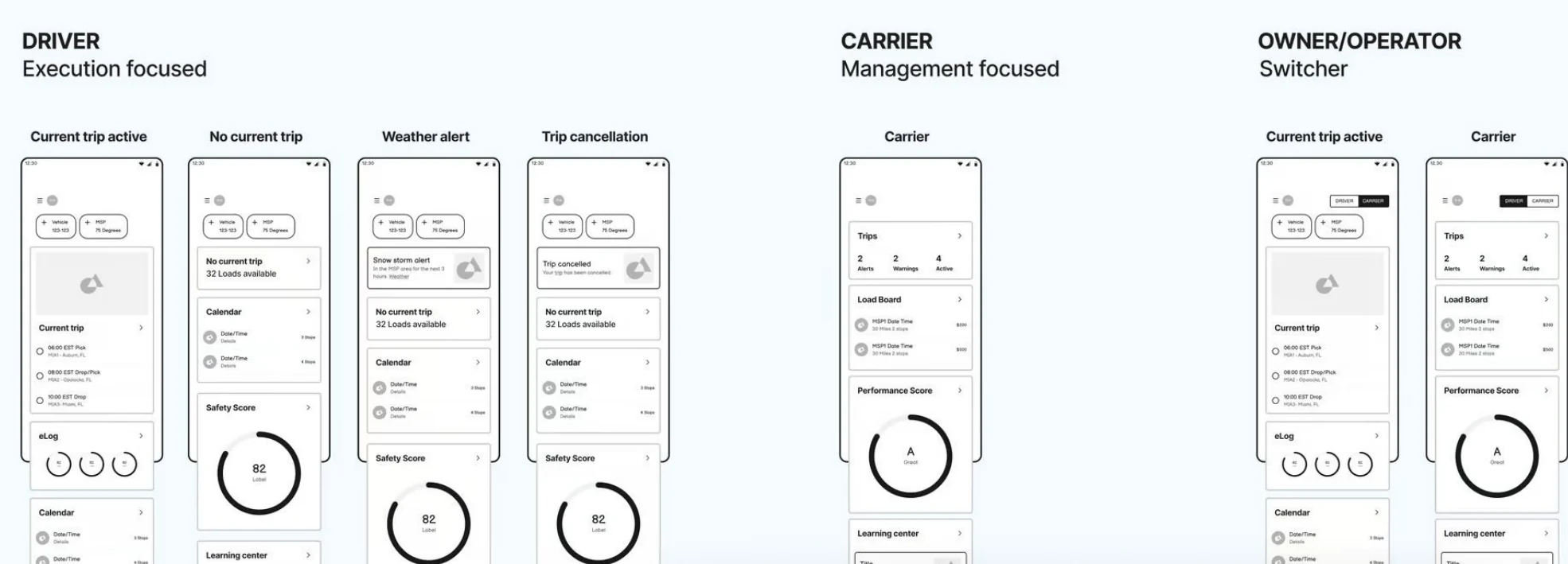
I explored a card-based home screen that put the driver’s current task front and center, while providing easy access to future and past loads as well as additional content drivers find valuable. The home screen became a curated collection of cards that springboard users into each capability. It summarizes the most important jobs across a driver’s whole journey, while the work itself happens in dedicated views.
Three goals anchored it. Focused: give attention to the most important task and reduce cognitive load. Organized: show status, progress and messages consistently, in context. Curated: summarize, don’t execute.
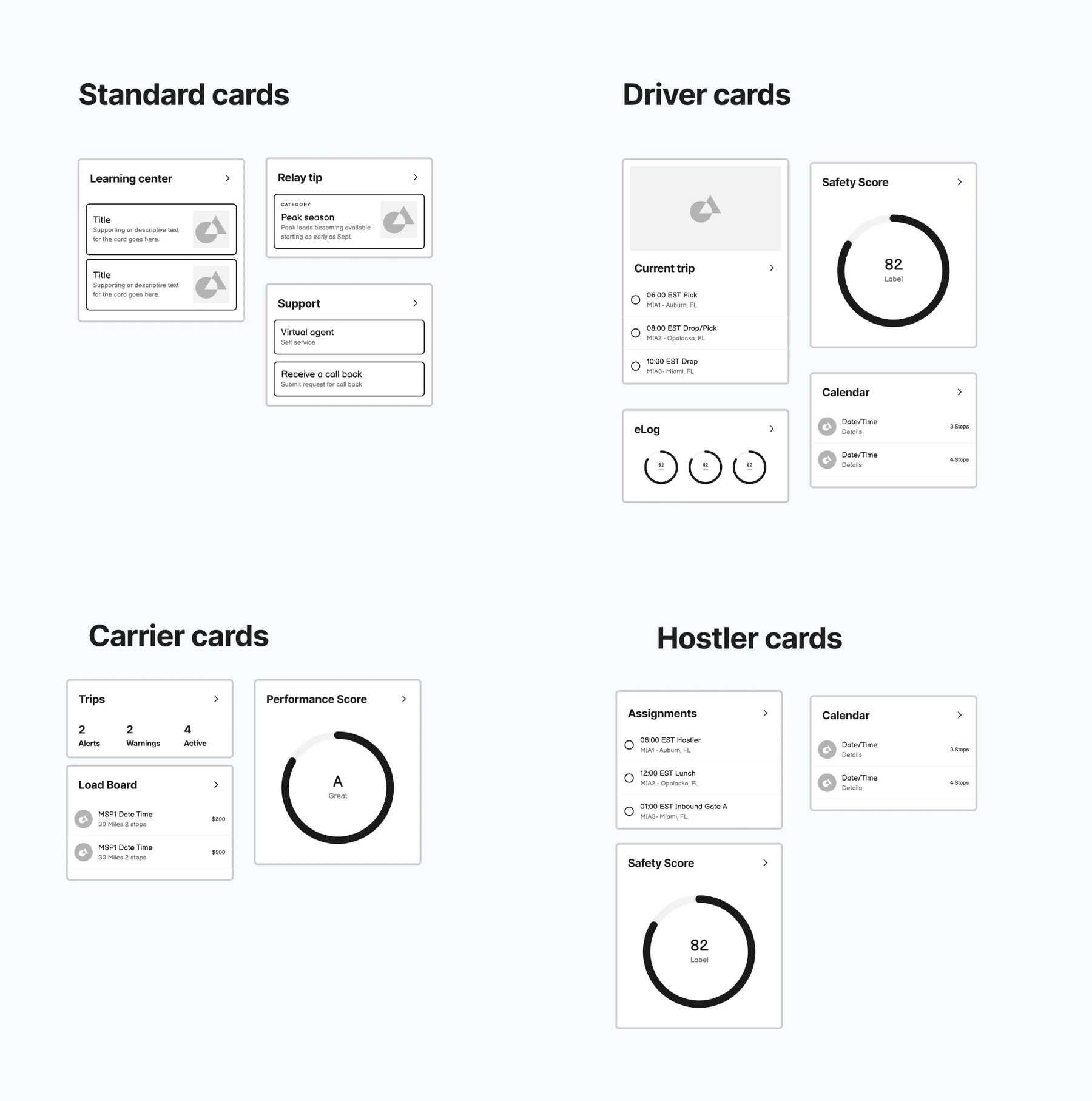
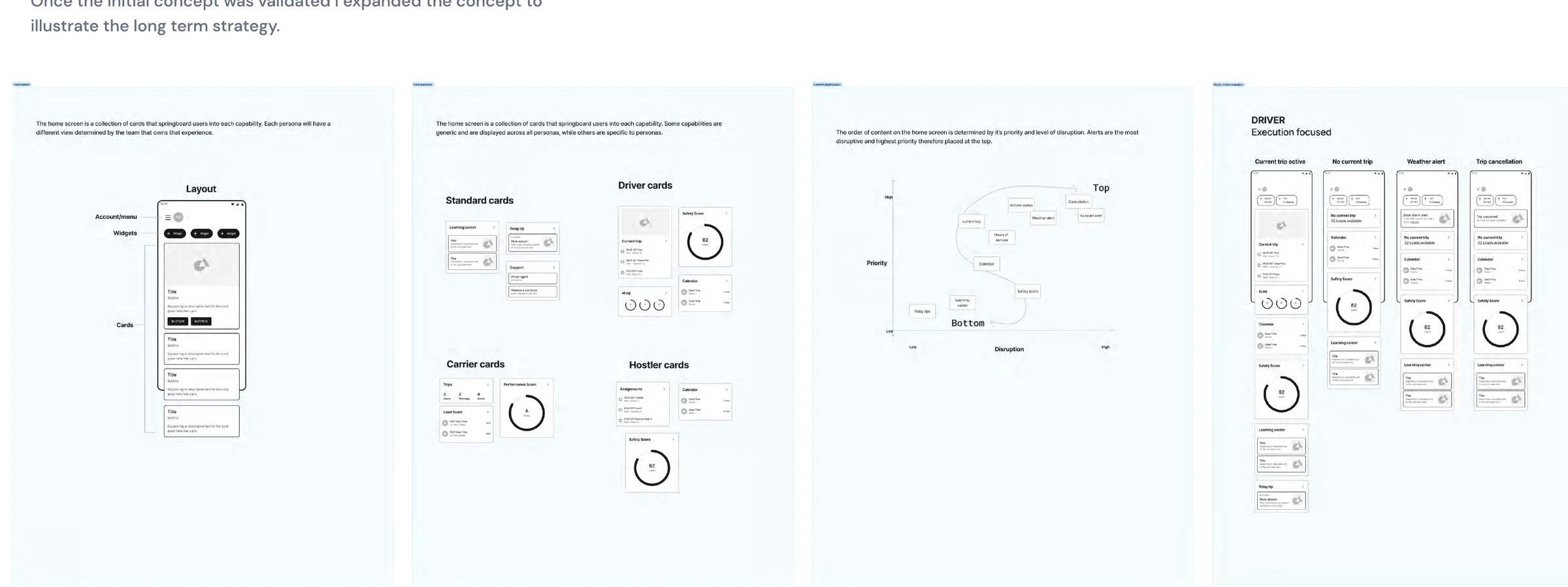
The structure is what made it scale, and the persona views below are where it was headed. Each persona can have a different view, determined by the team that owns that experience, so the same framework can show a driver their current trip and a carrier their load board and performance scores.
The home screen is account and menu, a row of widgets, then cards. Some cards are generic and appear across all personas, while others are specific to a persona.
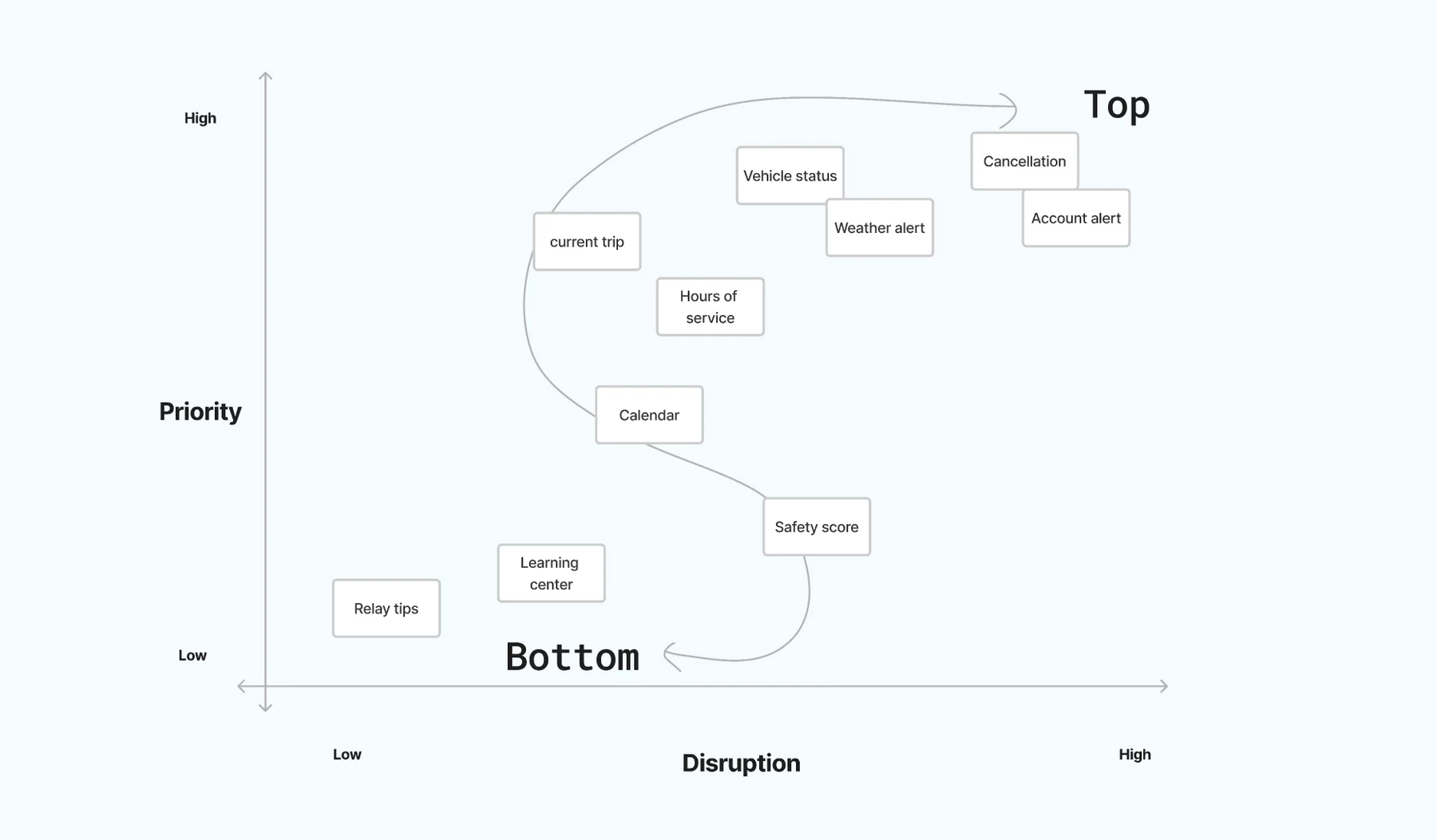
The order of content on the home screen is determined by its priority and level of disruption. Alerts are the most disruptive and highest priority, so they sit at the top.
4.2 Replace one trip at a time with a schedule
Planning and executing work are not linear. They happen at the same time.
Shipped in the first release
Previously, drivers could only see one trip at a time. We consolidated their work into a single schedule view, so drivers can see their current trip and plan for upcoming work in the same place, and move to previous and future stops to see their details outside the current stop.
4.3 Centralize everything about a stop in stop details
Stop details is where “all the time” information lives.
Shipped in the first release
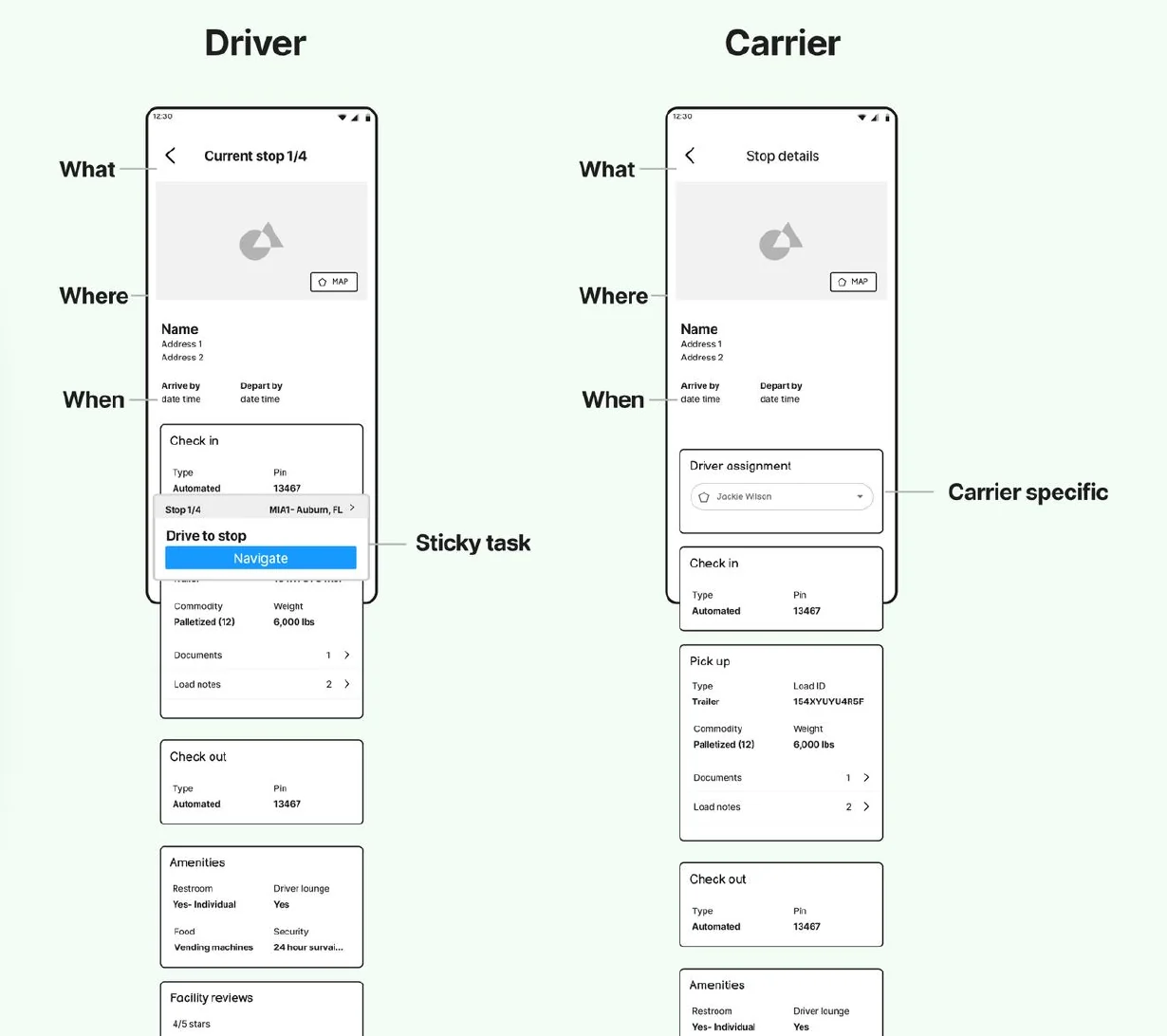
Stop details brings together everything about a stop: what, where and when, the pick-up and drop-off, load IDs, contact information and requirements such as safety equipment. Drivers can open it for the stop they are working on, or for any past or future stop.
For the first release it provided parity with the existing trips experience. The structure also left room for what came next: carrier-specific details, and new freight programs like Global Mile and Amazon Freight.
4.4 Ship the smallest change that achieves flexibility
The first release changed the structure around the workflow, not the workflow itself.
Shipped in the first release
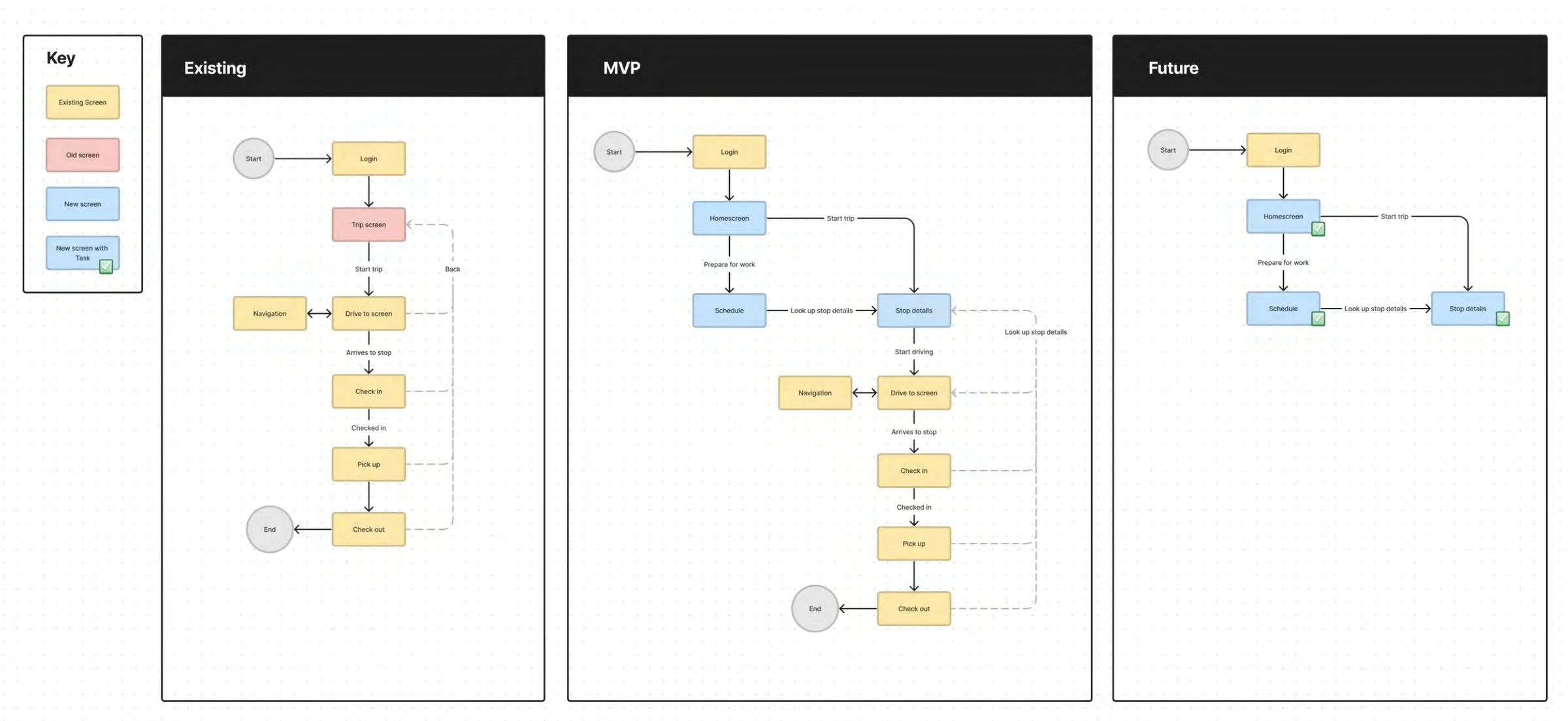
The goal for the first iteration was the smallest change necessary to achieve flexibility. We weighed three factors for the release: feature parity, so drivers could execute loads at the same rate as before; rate of change, because app feedback was generally good and we did not want to introduce large-scale changes; and time and resource constraints, because dev and time resources were limited. I put together diagrams to show how the app would work for the MVP release and future phases.
So the new home screen, schedule and current stop sit in front of the existing execution workflow. “Continue load” hands drivers into the screens they already knew, while the new structure gives them a way out of the sequence and back to their information at any point.
4.5 Make tasks sticky instead of modal
Drivers should always know where they are in their work, wherever they are in the app.
Direction for later phases
Previously, tasks were modal-like and took over the entire experience, making it difficult for drivers to reference other loads and information. In the vision, tasks become a sticky element on any non-modal screen (home, trip, schedule and stop details), with the option to expand to full screen, so drivers can quickly see what load they are on and where they are in their workflow. That gives them access to any content in the app while they complete their current work.
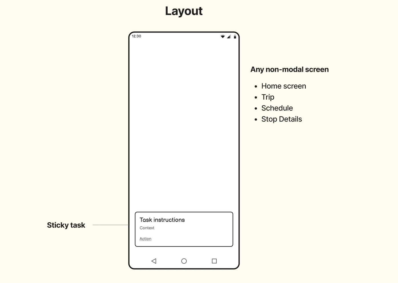
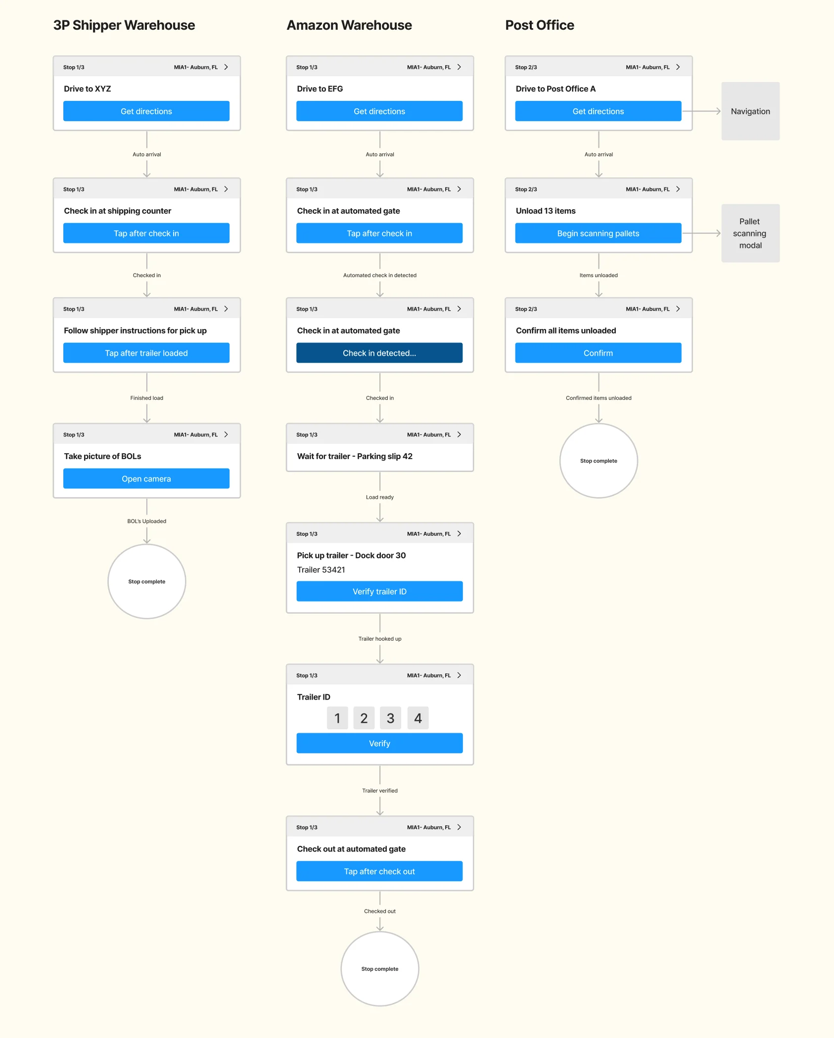
Each task carries the stop sequence, the task instructions with additional context, an action button, and a link to stop details. The same anatomy covers very different workflows, from a third-party shipper warehouse to an Amazon warehouse or a post office.
4.6 Keep the long-term vision visible without forcing it into the MVP
Once the first concept was validated, I expanded it to show the long-term strategy: the home screen, structured “sticky” tasks that could support complex workflows, and stop details. The full vision was never built. Amazon was balancing driver needs and scalability against the existing business, and not every right decision for users makes it above the line. The vision wasn’t throwaway, though. It showed the thinking behind the structure, and it pushed the organization to think about the app’s architecture in a different way.
Direction for later phases
Design system collaboration
I moved the app onto Meridian and contributed back where it had nothing to offer.
Migrating the UI to the Meridian design system was one of the project goals, and it made the new structure consistent with the rest of Relay. Where Meridian did not yet have a pattern for what drivers needed, I worked closely with the design system team and contributed patterns back.
Validation
The structure was tested with drivers before and after it shipped.
We tested the initial concepts with 8 drivers in a moderated usability study. We wanted to learn whether drivers could execute loads, discover future and past load information, and find additional content they might care about, like drive score and driver training. In that study, every driver appreciated having access to additional content and quick access to statuses and weather, and 7 of 8 could reach stop information and other content. The study also found problems: 3 of 8 struggled to start their work, 3 had trouble finding their trips, and 3 could not get to information for a future stop.
“I end up having to wait for my loads a lot of times and I like that I can check on my drive score and training in the app while I wait.”
I iterated to honor drivers’ existing mental models. I added a “start” button to the current task card, a paradigm drivers were used to from the previous design, and changed the “My Schedule” header to “Trips”, another familiar term. Then I brought the screens into Meridian’s visual language.
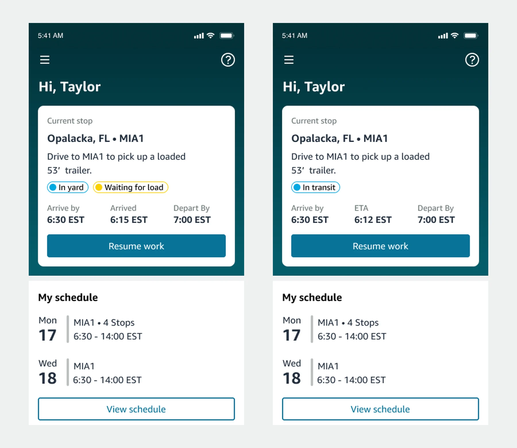
After the beta, 13 drivers rated the new screens. 12 were satisfied with stop details, 11 with the schedule and 10 with the home screen, and the average ease rating (SEQ) was 6.31 out of 7. Drivers asked for a map view on the home screen, the block or trip number they enter into their ELD devices, and total miles. A contextual inquiry with 5 drivers added more: some use both a phone and a tablet, 3 of 5 missed the “Load Ready” notification, and drivers use pick-up and drop-off IDs from stop details when they check in.
Launch
The new experience went to general availability at 1%, with a plan to reach 100% over the following weeks.
The timeline ran from kickoff and research in November 2021, through ideation in December and prototyping and testing in January, to detail design and handoff in February 2022. The beta surveys and field visits fed fixes before general availability.
The roadmap continued in phases: phase 2 planned to expand the home screen with vehicle pairing, weather and smart support.
05 / Impact
Drivers kept their pace, needed less help, and the platform could grow.
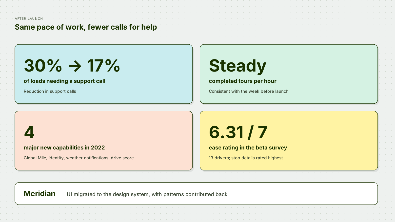
- Within a month of the release, individual product teams were able to release new features without coordinating new app releases.
- The foundation enabled four major new capabilities in 2022 with reduced design and engineering cost: Global Mile containers, identity, weather notifications and drive score.
- Completed tours per hour stayed consistent with the week before launch, so the change did not slow drivers down.
- Support calls dropped from 30% of loads to 17%, including fewer calls for load IDs and the information needed to check in.
- The UI moved to Meridian, increasing consistency and accessibility.
- Driver feedback was positive, and a new work stream formed to consolidate shared views across Relay’s carrier and driver products.
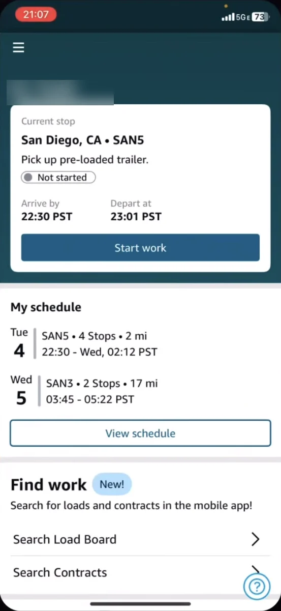
The model has kept absorbing new use cases. In a driver’s public video, the home screen still follows the same structure: the current stop with its start button, the schedule, and a new “Find work” card that brings load board and contract search into the driver app without changing the structure around it.
Reflection
Understand the boundaries first, then explore freely.
I start by working closely with engineering to understand how and why the experience operates the way it does. That shows me the real boundaries. Inside them, I explore ideas freely, with developers and others. The point isn’t what I come up with on my own; it’s taking all the ideas and deciding which ones to move forward based on impact, time and resources.
On Relay, that meant the most valuable decision was structural and mostly invisible: organizing the app around the objects drivers actually work with, leaving a place for the next persona, program or team to plug in, and shipping it in front of the existing workflow so it launched without slowing drivers down.
Not all of it shipped. The sticky tasks vision is still unbuilt, because the business weighed it against everything else it needed. I don’t see that as wasted work. A vision that doesn’t ship can still change how an organization thinks, and this one changed how Relay thought about its architecture.