Amazon Relay Load Board: Redesigning a freight marketplace for the next stage of growth
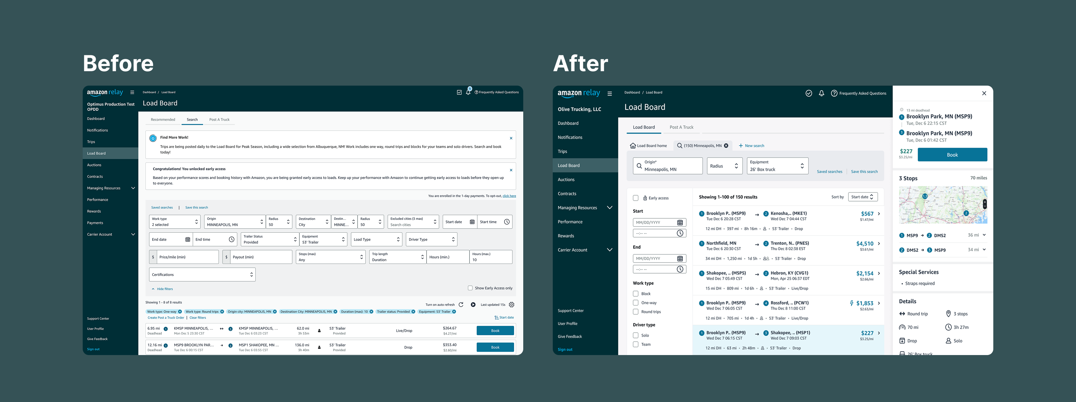
I led a four-month redesign of Amazon Relay’s Load Board, reshaping search, filtering, multi-search, load comparison, and booking so carriers could find work with less effort while giving the product a scalable interaction model for continued growth.
I inherited a redesign already in motion, but the interaction model had not yet converged. The work required more than producing screens: I had to help turn a broad growth problem into a product model the team could align around, test, build, and launch at Amazon scale.
00 / Context
The product had outgrown the interaction model it started with.
A search experience designed for a few hundred available loads and six filters was now supporting 100K+ weekly volume, as many as 27K trips at Peak, and 22 filter options.
Relay had also expanded into new freight types, work types, equipment, facilities, and geographies. The carrier base had broadened from owner-operators with relatively narrow needs to mid-sized businesses coordinating multiple drivers across regions and types of work.
The product still converted well, so the problem was not that Relay had stopped working. The problem was accumulated complexity: years of incremental capabilities had created an inconsistent landing experience, a search model carrying too many responsibilities, and a booking flow that did not always surface critical information before commitment.
The business was still growing. With limited time, budget, engineering capacity, and legacy architecture, the redesign had to improve the current experience without creating another model that would need to be replaced as soon as the next capabilities arrived.
Product goals
- Speed — reduce time and effort to find and book work.
- Confidence — surface the information and eligibility constraints carriers need before committing.
- Flexibility / personalization — support different drivers, routes, equipment, and work preferences.
- Scalability — preserve speed and confidence as Amazon and individual carriers continue to grow.
01 / People
Carriers were not browsing a marketplace. They were continuously assembling work.
Most carriers arrived with meaningful constraints already in mind.
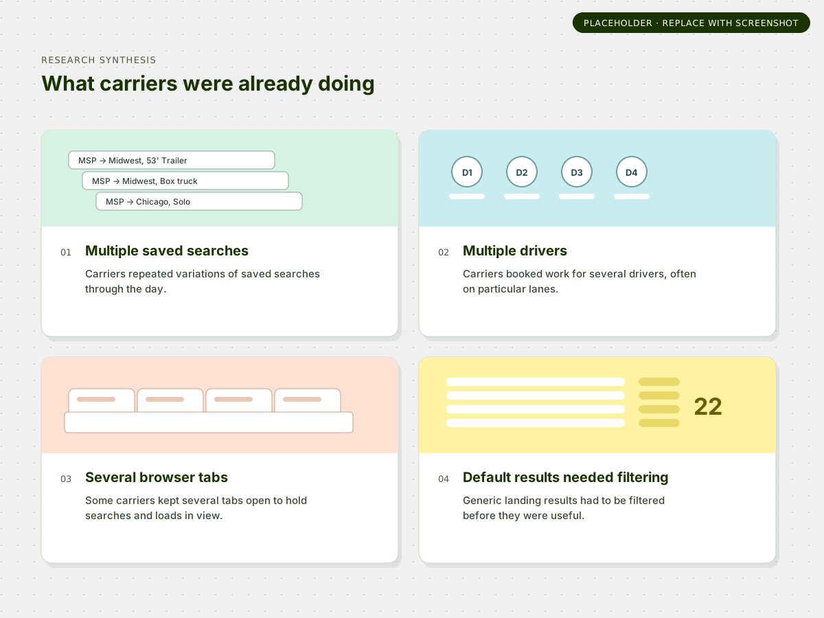
They monitored the Load Board throughout the day, repeated variations of saved searches, booked for multiple drivers, and often focused on particular lanes or kinds of work. Before the redesign, some carriers were already managing several browser tabs at once just to keep different searches and loads in view.
That behavior changed how I thought about the product. A search was not always a disposable query; it could represent a driver, a route, a backhaul, or a piece of work the carrier was actively monitoring.
The default experience, however, often dropped carriers into a generic or inconsistent landing state and then required them to work through a large set of parameters before results became useful.
Help carriers express the work they are actually available for first, then make the remaining options easier to evaluate.
Methods desk research · carrier interviews · existing-experience analysis · competitive review
02 / System
The redesign needed a foundation, not another layer of features.
The immediate problem was usability. The larger problem was structural.
Search, recommendations, saved searches, Post A Truck, filters, trip details, booking controls, and new programs had accumulated in different parts of the experience. Every additional feature made the underlying model harder to extend.
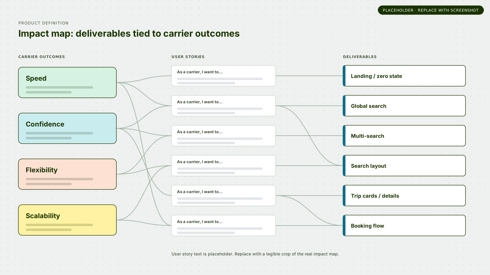
Working with the PM, I helped organize the product definition into three layers: establish the new foundation, improve the core booking workflow, then expand on that foundation with later capabilities. That framing helped keep valid future needs visible without forcing them all into the MVP.
Foundation → Core workflow → Extension
- Foundation: landing/zero state · global search · multi-search · search layout.
- Core workflow: trip cards/details · booking flow.
- Extension: richer discovery · watch/favorite/pin behaviors · additional personalized experiences.
I also had to discover which constraints were actually real.
Not all project boundaries were clear when design exploration began. Some constraints were architectural, some were cost decisions, and some became explicit only after product and engineering conversations.
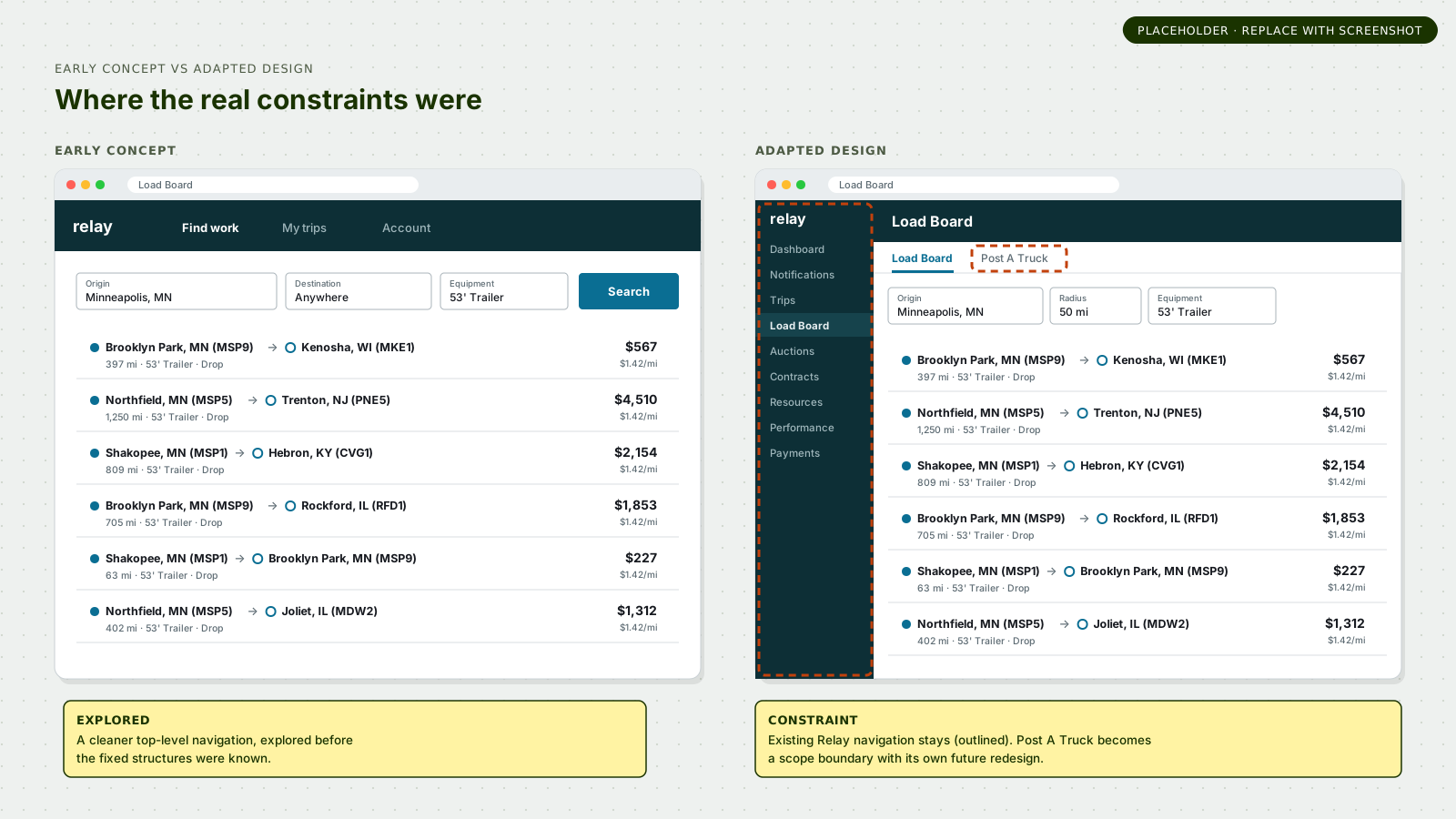
For example, I explored a cleaner top-level navigation model before learning which existing Relay structures could not be removed within this project. Post A Truck eventually became an explicit scope boundary with its own future redesign, while transitions between the experiences still had to be considered.
That pattern repeated throughout the work: explore far enough to understand the better model, then determine what was technically feasible, what was worth changing, and what belonged in later scope.
03 / Gaps
The old experience was making one search model carry too much complexity.
The team could keep adding controls, or we could create a model that had somewhere for future complexity to go.
Carriers needed a small set of criteria to define viable work, but the growing product had accumulated 22 parameters. They needed to monitor more than one work context, but the product treated search as one temporary state. They needed richer load information, but navigating away from results interrupted comparison. And they needed booking speed without the risk of making costly mistakes.
The design problem was therefore not one feature. It was how the landing experience, search, filtering, multi-search, details, and booking flow should work together as one coherent system.
How might we support increasing marketplace complexity without making the experience increasingly complicated?
04 / Design
The final UI looks straightforward. Getting there required a series of deliberate structural decisions.
Each decision had to survive user research, product scrutiny, engineering constraints, design-system calibration, and the needs of a rapidly growing marketplace.
4.1 Separate primary search from secondary filtering
Search should define viable work. Filters should refine it.
The existing model had grown from six filters to 22. Continuing to place every new criterion into the primary search would make the starting interaction increasingly difficult to understand and increasingly expensive to change.
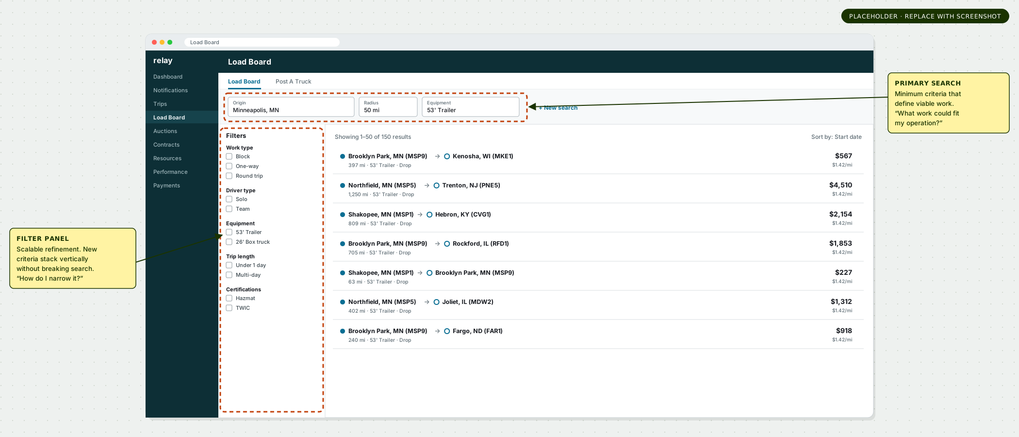
I reduced the global search to the minimum criteria needed to establish viable work, then moved the expanding set of secondary parameters into a persistent vertical filter panel alongside results.
That created a durable distinction: the primary search answers “What work could fit my operation?” while the filter panel answers “How do I narrow those viable options further?”
The structure was intentionally extensible. New criteria such as certifications, equipment, eligibility, and future program attributes could be added vertically without breaking the core search layout.
All five carriers in high-fidelity testing preferred the sidebar filter pattern and found it easier to discover and customize.
4.2 Productize the workaround: multi-search
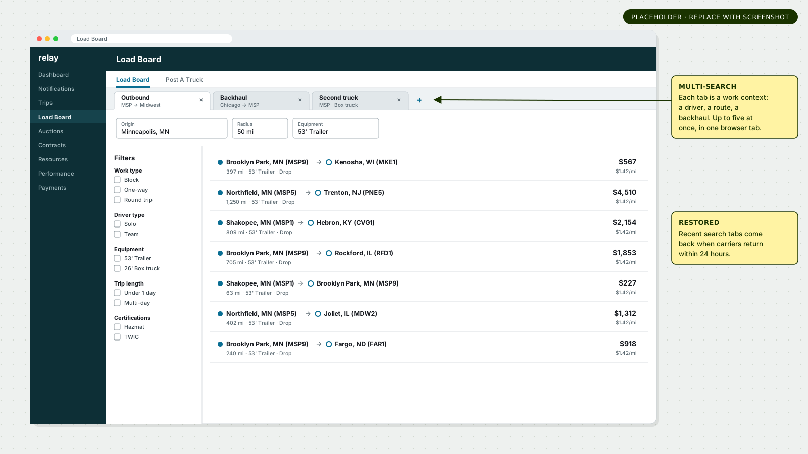
A search could represent a driver, a route, a backhaul, or another active work context.
Research showed carriers already approximating this behavior through saved-search variations and multiple browser tabs. Rather than treating that as incidental behavior, I designed multiple active search instances directly into the Load Board.
Carriers quickly supplied their own use cases: an outbound load in one search, the return trip in another, and a third search for another truck. Three of five test participants said the tabs would improve booking efficiency.
This became one of the deliberately custom patterns in the redesign. By launch, carriers could keep up to five simultaneous searches in one browser tab, and Relay restored recent search tabs when they returned within 24 hours.
The interaction also had real technical cost. Multi-search increased expected transaction load, so engineering reduced results per page from 100 to 50 after data showed that more than 95% of searches returned fewer than 50 results. We preserved the workflow value while making a data-backed implementation tradeoff.
4.3 Turn load details into a persistent work surface
Carriers needed to inspect a load without abandoning the marketplace around it.
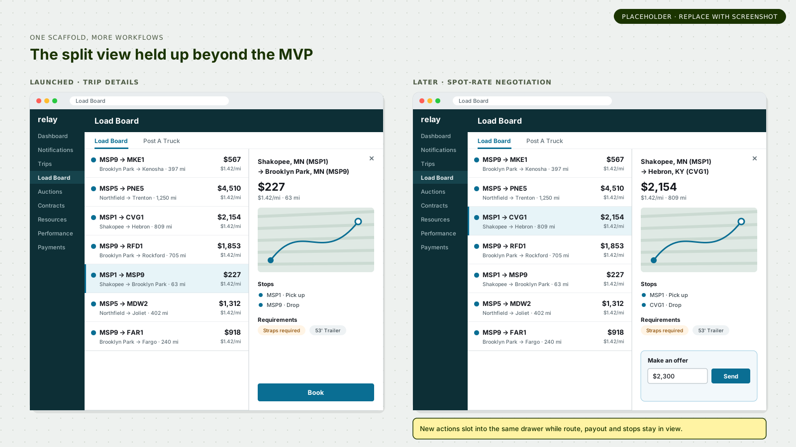
I introduced a split-view detail drawer beside the result list. It kept search results visible while giving the selected load enough space for stops, map context, payout, requirements, special services, and actions.
The pattern solved more than navigation. Results could continue refreshing while the carrier inspected details, and critical requirements could be surfaced before booking rather than appearing as a surprise afterward.
All five usability participants preferred reviewing load details in the side panel. I also designed the drawer as a flexible surface rather than a fixed content template so future workflows could extend it without replacing the surrounding information architecture.
That extensibility later became visible publicly: newer Relay workflows, including spot-rate negotiation, use the same split-view idea to introduce new actions while route, payout, stops, map, and load information remain in context.
4.4 Optimize for speed and confidence, not click count
Sometimes the safer interaction is one step deeper.
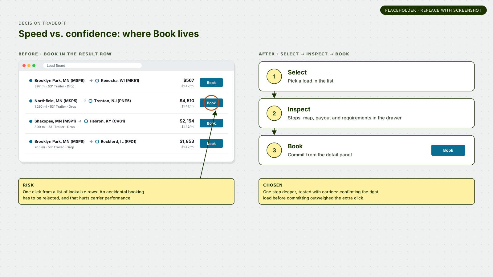
The original Load Board put Book directly in the result row. That minimized clicks, but accidental bookings could force carriers to reject work and hurt their performance.
Moving Book into the detail panel was debated because speed mattered greatly in a competitive marketplace. We tested the tradeoff rather than resolving it by principle alone.
Carrier feedback leaned toward the new placement: users valued confirming the correct load before committing, and several specifically called out accidental bookings in the existing model. In this case, booking confidence took precedence over absolute minimum interaction count.
4.5 Keep valid future needs visible without forcing them into MVP
Not every useful idea belonged in the first release.
Research also surfaced a need to monitor or hold individual loads while waiting for prices to change or confirming with a driver. We explored watchlists, pinning, favorites, pop-out details, and later real-time behaviors.
Those needs were real, but not all were mature enough or essential enough for the MVP. We preserved them in the product definition and designed the foundation so they could be added later rather than expanding the first release indefinitely.
This was part of the project’s scalability work: not predicting every future feature, but creating places for likely future behaviors to fit.
Design system collaboration
I used Meridian as infrastructure, not as the boundary of the solution space.
The design system was still young, and it did not yet have patterns for every problem Relay was encountering.
My approach followed four steps: explore the strongest customer interaction first; move those ideas toward existing Meridian patterns; calibrate directly with the system team through office hours and reviews; then deliberately decide which remaining snowflakes were worth the cost.
The formal design review explicitly asked whether the work adhered to Meridian and where we were ‘diverging with intention.’ At the time, Meridian had no standard search pattern for this problem space.
Multi-search is a good example. It introduced a custom interaction and additional technical cost, but the carrier behavior, usability evidence, and operational value were strong enough to justify the investment.
Design-system principle
Use the system aggressively where it solves the problem. Challenge it deliberately where it does not—and earn the exception with evidence.
Validation
The model was scrutinized before it ever reached broad launch.
The apparent simplicity of the finished experience came after repeated research, design review, product-definition work, technical discussion, and testing.
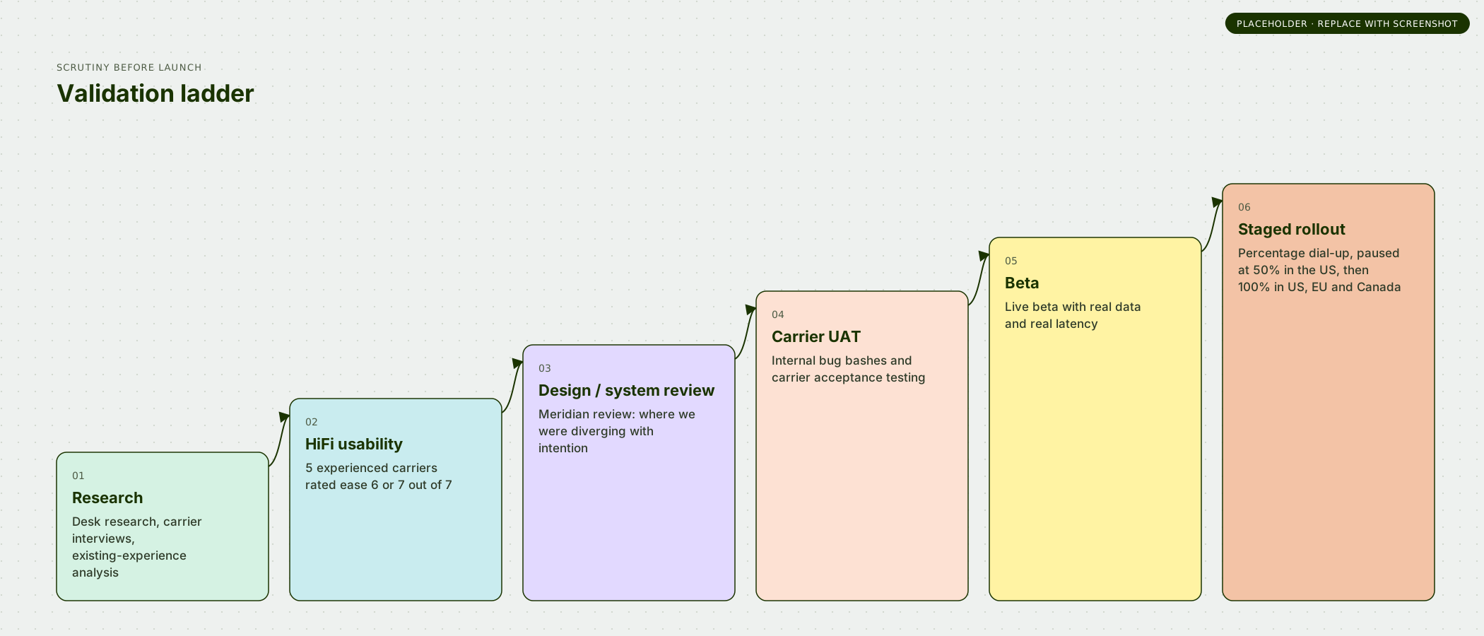
High-fidelity moderated testing covered the landing experience, search, filtering, load details, booking, and net-new features. All five experienced carriers rated the overall experience 6 or 7 out of 7 for ease, with no major UX blockers.
Testing did not simply validate the concept. It sharpened terminology, time-zone behavior, tab scalability, stop-information priority, booking placement, and confirmation latency. Later production feedback surfaced a small set of responsive-layout and control-placement issues that were folded into Phase 2 and fast-follow work.
The design then moved through internal review, carrier UAT, beta testing, and staged production dial-up so the interaction model could be evaluated with real data, real latency, and different carrier cohorts.
Launch
The rollout was designed to reduce risk at Amazon scale.
The GTM split the experience into phased releases with internal bug bashes, carrier UAT, live beta testing, and gradual public dial-up before full rollout.
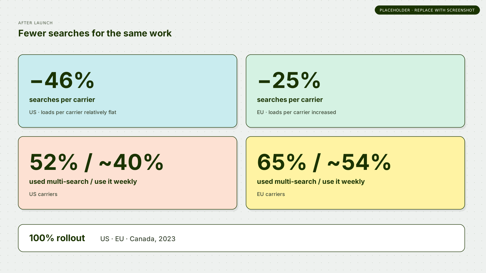
The public release began with a small carrier cohort and expanded through percentage-based stages. In the US, Product paused the rollout at 50% when early business metrics were mixed, using the pause to gather a larger sample, review carrier feedback, and distinguish short-term learning effects from more fundamental problems. The core UX held up; the team identified addressable refinements rather than foundational issues, then continued the rollout. The design ultimately reached 100% in the US, EU, and Canada in 2023.
That context matters because the design decisions had to work far beyond a prototype: across real marketplace latency, different operating models, global markets, learning curves, and measurable business risk.
05 / Impact
Carriers found and booked work with substantially fewer searches.
The clearest post-launch signal directly matched the problem the redesign was intended to solve.
In the US, Search per Carrier declined 46% while Load per Carrier remained relatively flat—carriers were finding and booking roughly the same amount of work with substantially fewer searches.
In the EU, Search per Carrier declined 25% while Load per Carrier increased.
Multi-search also saw strong real-world adoption: 52% of US carriers had used it, with about 40% using it weekly; in the EU, 65% had used it and roughly 54% were using it every week.
Post-launch carrier feedback echoed the research themes: easier multi-location searching, simpler booking, fewer dispatch mistakes, and less risk of overbooking.
The longer-term value was structural. Relay explicitly planned to use the redesign as the foundation for more personalized load discovery, including recommendations, suggested reloads, and targeted promotions. The split-view pattern also continued to support newer workflows later.
Reflection
The simplicity of the final design was the outcome of complexity, not the absence of it.
The visible features in this redesign are not exotic: a smaller search, a filter panel, tabs, a drawer, a booking action. The difficult work was deciding exactly what each of those structures should be responsible for, what should remain familiar, what needed to be invented, what could scale, and what the organization could realistically build.
This project reinforced the kind of design leadership I do best: create shared understanding in a complicated problem space, help define the product alongside product and engineering partners, make tradeoffs explicit, and carry a coherent interaction model all the way from ambiguity to launch.